Tuesday, December 31, 2013

Erwin Blumenfeld (1897-1969) au Jeu de Paume

Erwin Blumenfeld, The Picasso Girl, 1941-42

So many fashion photographers end up selling their creative soul to the jaws of commercial demands, sacrificing all trace of experimentation to meet the needs of advertising the client and to feed the bank balance. Not Erwin Blumenfeld. Until the very end of his career, he was able to incorporate creative flair into otherwise generic advertising images, Vogue and Harper’s Bazaar’s covers, as well as the films he made for the Dayton department store in Minneapolis. The current exhibition of his work at the Jeu de Paume shows a lifetime of Blumenfeld’s work, an oeuvre that is always looking and searching for the vanguard of photography. In fact, some might even argue that the fashion photography is among his most exciting work.
Erwin Blumenfeld, Self-Portrait, 1945
The exhibition is curated by a leading scholar of modern German photography, Ute Eskildsen of the Museum Folkwang in Essen. The sophistication of Eskildsen’s knowledge of the period in which Blumenfeld was working, together with her experience as a curator, shows in what is a revellatory hanging of his work. The photographs are organized generically, moving from the pre-photographic montages and drawings, through portraiture, nudes, architecture to fashion. Thus, rather than following chronological development, we are witness to how different subject matter enables Blumenfeld to bring out the singularity of what was, at the time, this relatively new medium of photography.
Erwin Blumenfeld, Three Profiles, 1952
From the beginning Blumenfeld experiments. He explores light, reflections through the use of mirrors, shadows, darkness, always intensifying the schism between the positive and negative of a photographic image. In some works, he moves far beyond chiaroscuro to blackening out the entire ground, until in 1952, the face in profile is reduced to an outline of coloured light. In Three Profiles, the negative and positive photographic print cannot be distinguished, the two are here brought together.  This theme of the negative and positive, inside and outside, opposites in a single image – is extended beyond the formal to the complexity of the person in the portraits. From the beginning Blumenfeld finds the female form in the male body, the inanimate in the human, the grotesque in the beautiful. Blumenfeld achieves this through overlaying multiple negatives, combining different elements in the darkroom, thus creating a montage in the process of photographic production.
Erwin Blumenfeld, Voile Mouillé, 1937
Blumenfeld is truly interested in the female form: it’s not an academic exercise. And all of the screening and masking, the various techniques and ruses of composition used to hide or complicate the form, serve to emphasize the form of the figure and depose the identity of the sitter. When he comes to photograph buildings, they resemble the portraits. That is to say, the light is magnificent in its use to bring out the form and structure. Again he uses double exposures, and manipulations of light to abstract the buildings to convince us that form is itself an artistic creation, just as if it were the female body.The final fashion photographs are sumptuous. We see Blumenfeld’s fascination with light transform into a dexterity with colour. He maintains the use of mirrors, privileges over and under exposure, to create figures that are spectres of their selves, or fragmented by a camera that replicates them without original.
Erwin Blumenfeld, Hitler with Bleeding Eyes and Mouth, c. 1953
Throughout the exhibition I felt Blumenfeld’s photographs always to be disturbing. In the early collages he includes images of soldiers, and other icons of war, even if fragmented, as a way to protest the violent ripping apart of his country and his people. And in response to National Socialism, he made an images of Hitler with bleeding eyes, and another of a skull superimposed on a portrait in what are now darkly prophetic images. Everywhere in Blumenfeld’s images there are distortions, double exposures, superimpositions, uses of light and mirrors to create screens, fractures. And then there are broken images, like Broken Mirror Nude, 1947. The text says that these works are playful and clever but for me, they are filled with trauma and a sense of being eternally fragmented. It’s difficult not to read the images as somehow reflective of Blumenfeld’s broken biography. As a German Jew he was literally hunted from one country to another, always trying to get away from the Nazis until he reached New York towards the end of the war. Without detracting from the intelligence and creative innovation of these photographs, the violence and drama appears to extend way beyond the technical and formal levels. To me all of these photographs, but particularly the portraits, tell the story of someone who carried the troubling scars of anti-Semitic persecution throughout his life.

Friday, December 27, 2013

Georges Braque au Grand Palais

Georges Braque, L'Oiseau noir et l'oiseau blanc, 1960

There are very few painters, most of them from the first decades of the twentieth century, who remain consistent in their concerns across their lifetimes. Georges Braque is one of them. All of Braque’s formal and thematic concerns, as well as the way they are executed, appear and reappear throughout his career, often in different ways, often after a break of years, but they all return in some shape or form. In this, together with an artist such as Mondrian, Braque is the archetypal modernist painter. The current exhibition at the Grand Palais is an awe-inspiring confirmation of Braque’s place in modern painting.
Georges Braque, La Viaduc de l'Estaque, 1908
To give some examples of recurrent tropes and techniques: throughout his career, Braque painted in brown, grey and green, the colours of a modern world, at times with the green of nature dominating, even framing the image —such as in La Viaduc de l’Estaque, 1908. In the Analytical Cubist images, when form takes over the canvas as the subject matter and intention, green becomes laced through the fragments, barely perceptible, but unmistakeably tinting the grey and brown. The same could be said of the flowing curvilinear lines that shift around the canvas, sometimes defining the object and subject, at others decorating it, even when everything collapses in the Analytical Cubist paintings. There is always line, always, and the dynamic relationship between line and colour, in which line is often demarcating a form, is what holds Braque’s composition within the figurative. And then there are gestures, techniques, forms that recur years later, unexpectedly, often to meet different ends. For example, the brightly coloured staccato strokes, that we see in the Fauvist works such as the landscapes at Estaques reappear to create light and shadow in the Analytical Cubist paintings from 1910 onwards. Always, Braque seems to be thinking about the question of breaking down representation, and across his long career, he uses the same vocabulary, even if it looks different in its articulations as the years pass.
Georges Braque, La Plaine I, 1955-56
The surprise of this massive exhibition were the final works that I did not know, presumably because they are held in private collections. The absolutely exquisite “final landscapes” — somewhere between 20 and 22 cm in height and between 72 and 77cm in length — are horizontally dissected, like studies for the possibility of abstraction in thick, glossy, impastoed paint. These works are divine because they are pure paint as colour, more abstract than anything Braque has done up to this point, even more abstract than the Cubist works from forty-five years earlier. Their horizontality not only makes them unusual, but their relative intimacy exaggerates their reflectiveness, their quietness, and beauty. Similarly, the black birds on a sky pale blue background are sumptuous. Like all of Braque’s works, the birds are given enough form to be recognizeable as birds, and are abstract enough to be not quite representational. But it is the unusual blue, radiating light and simultaneously resembling the sky that makes these works so striking.
Georges Braque, Glass and Plate of Apples, 1925
In spite of what is said about  Braque’s paintings, particularly the Cubist works, even when everything falls apart on the canvas and the instruments, vessels and human figures become fragmented, shattered geometrical and compact volumes that emphasize the two dimensionality of the painted canvas, there is still form. It never disappears altogether, just as the green of nature that has played such a prominent role in the earlier paintings, never quite leaves the canvas. However Kaleidoscopic the images, we can always recognize form, even if only in a fragment, this fragment is enough to give us a clear sense of the figure represented. To give one example, in a work such as Violin and Candlestick, 1910, the violin is given dimensionality through the use of line, again, giving depth and volume to the otherwise flat surface. Line always constrains the movement of the paint inside the forms it outlines. Line always, ultimately, creates form on Braque’s canvases.
Georges Braque, Violin and Candlestick, 1910
I remember Annette Michelson telling me, quite definitively, that perspective really fell apart, once and for all, with the coming of World War I. Until I saw this exhibition, I think I have always believed her. But today, twenty years later, as I wandered this huge and comprehensive exhibition, I wondered. Certainly, as Braque’s work is here chronologically laid out, I saw how much of the collapse of perspectival space, the battle of figure and ground, actually came from the forward motion of the history of painting. Cezanne is everywhere in Braque’s still lives, the influence of skewed spaces, the use of painting techniques that break up the illusion of reality. And one could just as easily argue that Analytical Cubism is in fact the next step in the trajectory that sees houses painted from on high, looking down at them, a perspective that comes thanks to the invention of photography and airplanes. The brown blocks, green trees, tightly packed built environments are easily transposed to the formal organization of violins and vases.


Thursday, December 19, 2013

Art and Heels in Miami


View from SCOPE Pavillion, South Beach, Miami
I am sure everyone has a story or two to tell about Art Miami, but for me, the big event was the coming together of the Artslant team, some of whom I had only ever met on skype, others of whom I only see once a year. People would ask us, “so where are you based?” And in keeping with Georgia’s legacy, a woman who stuttered and stumbled when asked “where is home?,” Artslant has no geographical home. We exist on the web for 360 days of the year, and take up residence in Miami for the other 5 days.

There were a lot of this vein of sculpture:
figures climbing walls
CONTEXT Pavilion, Miami Beach
During the day, the Artslant team tended to arrive on mass, four or five of us, with our Editor in Chief, Natalie, making sure we were all given VIP treatment. This translates to Natalie ensuring that we all got entry to the different fairs. As was to be expected, in each of the fairs, there were usually one or two artists, sometimes only one or two artworks, worth looking at. Museum pieces sat on the same walls as trash, vintage Robert Indiana pieces next to works by unknown artists. Art Miami is art on sale, not so different from a car show, glistening brand new, with gallerists trying to get the attention of those wandering through, to convince us to buy works we would otherwise probably walk straight past, in any other context.
Denny Gallery Booth, Art Miami 
That said, when I could drag myself away from the sight of the ocean outside the marquee, I made some exciting discoveries. Jason Gringler’s big American and male canvases covered with shattered, broken, fragmented materials were stunning. In fact, all the work at New York’s Denny Gallery was strong, and Gringler’s aggressive, but subtly crafted “paintings” that were more like collages, stood out for their complexity. David Burdeny’s long exposure photographs of cities, iconic visions made strange and unusual, given luminosity and a simultaneous haze descending over skylines we might know, sites we have seen many times before. Thanks to Burdeny's technique cities suddenly become strange and somewhere we haven’t been before. New York, London, Venice, Paris, all are in the distance, with skylines that look more like horizons than an urban metropolis. This is in keeping with the landscapes, made abstract and unusual, again distinctive but unrecognizeable. 
David Burdeny, San Marco Dawn, Venice, Italy, 2012
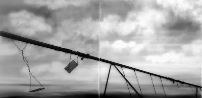
Another set of works that stood out for me were the haunting, to the point of being devastating, wintery visions of Claudia Melli, exhibited by the H.A.P. Galeria in Rio de Janeiro. Again, all the images in this stand were provocative, with Melli’s standing out. We stood a couple of feet away from the images, identifying them as photographs, discussing how haunted they were, how eerie and unsettling. A child’s swing with the seat broken, the chain blowing in the wind, the only background being a dark sky filled with looming clouds. Standing before the images, we can feel the cold of the world shown in a realist image. And then, the man from H.A.P. Galeria told us we were looking at drawings made with Chinese ink. With this information, it was impossible to see them as anything other than drawings, but until we were given it, there was no question they were photographs. What makes the works even more haunting is that they were hung in a series, across images there is no respite from the emptiness, desolation, coldness and trauma even that is suggested in their content, a suggestion echoed by the grey material of ink on paper.

Claudia Melli, A Capella, 2011 
After hours, aside from the art and the Artslant union, my first and lasting impression of the who’s who of Miami, and the who’s who of the contemporary art world were the heels. Never have I seen so many women in heels so high that they were unable to walk. It is easily possible that I do not move in the right circles to appreciate the latest fashion, and it is even more possible that the translation from catwalk to sidewalk is very different in Paris. Nevertheless, I have never seen heels so high and so impractical in such numbers. Women strut around the streets of Miami, are seen in the places to be and hobble from art venue to art venue on 13’ heels that look to have been bought especially for the occasion. As a heel wearer, I know from experience that the height of the heel always becomes comfortable, in time. But judging from the tottering between the car service and the bar, from one gallery to the next, most of the heels in Miami were a one time affair. Indeed, they belonged to a world as different from mine as the meaning of art in Miami.