Monday, June 30, 2014

Marina Abramovic: 512 Hours @ Serpentine Gallery


In the 1990s on my way home from an afternoon in Chelsea, I popped into what must have been Sean Kelly to see Marina Abramovic who was living in the gallery for five days. It was an experience that I will never forget as I found myself in a trance for two hours, building a relationship, so I thought, with the artist, but really, as I recognized today at the Serpentine, the relationship was with myself.

512 Hours at the Serpentine Gallery is a big London event. Apparently there have been long lines waiting to be with Marina over the past week, and it’s not just the British love of queues that has them stand in the rain waiting hours. It is as though the wait is part of the ritual of seeing and experiencing Abramovic these days. I had heard that Abramovic had “lost it” and that this wasn’t such a great performance. So when my friend wanted to visit the Saatchi Gallery instead, I agreed. But then when the Saatchi Gallery was closed for a private event – as only the Saatchi Gallery would be – we had no choice but to wander over to 512 Hours at the Serpentine. Fiction number one in the reviews was exposed. There was no line: we walked straight in, that is, after putting all our valuables, mainly technologies, in a locker.


Marina Abramović

As always I was enthralled. I can only describe being in Abramovic’s presence as similar to being hypnotized, but I am not sure that’s what it was. I was transported into a trance-like state, and had an out of body experience through a form of deep meditation. I have been practicing meditation for years, but am never very successful at it – I usually end up remember the email I need to send, or needing to make a note of that call I forgot to return. But when Abramovic took my hand and led me to a long platform, behind a row of chairs looking out at the curtained windows of the Serpentine Gallery, I was transformed into the perfect Buddhist. I stood on the platform motionless, not even experiencing my body, completely transported into a meditative awareness. That was until the woman Abramovic had placed next to me, left. I panicked. I felt pulled away, and I was thrown into an emotional or spiritual turmoil: I didn’t know what to do. Should I leave, should I stay, how do I know when to leave, can I just rely on the gallery closing as a way of knowing my time had come? And as I stood longer, the feeling of anxiety grew. I cannot say how long I stood there because I had agreed to the contract with Abramovic by placing my watch in the locker before entering the gallery. Though I couldn’t say how long I was present, I did learn exactly how intense it is to be in the company of myself. This is what makes Abramovic an artist: she creates an environment within which she facilitates a new experience of ourselves, if we dare.

Eventually I walked off the platform and stood leaning on the wall, disoriented, almost groggy with the experience I had just had, watching people at Ikea tables with rice and lentil grains. Apparently, Abramovic taught Lady Gaga to count the grains as a way to stop smoking. But I am not sure that’s what the 30 or so people were doing in the central space of the Serpentine. One man had fallen asleep, another was in a trance, another counted the grains, and yet another wrote about them. Whatever their activities, all were so engrossed that they were oblivious to anything going on around them. I found myself watching regular visitors to performance as though they were the artists. Very quickly, I was scooped up by an artist’s helper and taken into the third gallery space, placed in a chair and given noise cancelling headphones. Others had had the headphones before me and I had wanted them. Then when I had them, I knew why I wanted them: the experience was intense. Even more so than when I had stood on the platform. With no external noise, my meeting of my own emotions was heightened. Again, I was immersed into a deep meditation from which I had no need to ever return. This time I was “stopped” in my self-discovery by the close of the museum.
marina abramovic


I find Abramovic captivating because I don’t know any other artist who is able to create such a presence that I have no desire ever to leave. Surely this is the essence and definition of art, it is art stripped to its most elementary ingredient: pushing the viewer to the limits of why we are, a taking us to a place we might have known existed, but to which we were too afraid to go.  For all those who claim that Abramovic has had her day, I wonder how prepared they are to look at themselves in the mirror created by Marina Abramovic?

Thursday, June 26, 2014

Andreas Gursky, White Cube, Bermondsey


Andreas Gursky, Lager, 2013
Without a doubt, Andreas Gursky’s recent photographs on exhibition at the White Cube in Bermondsey convince that he is the most exciting photographer of our generation. As I walked around the impressive gallery spaces, I kept thinking of my disappointment at the Jeff Wall retrospective at the Stejdlik Museum in Amsterdam. As I bemoaned at the time, Wall doesn’t seem to be doing anything he wasn’t doing ten years ago. I attributed the lack of surprises in Wall’s work to the Stedelijk Museum’s curation, but having been completely swept away by the innovation of Gursky’s recent work, I am beginning to think it might be the artist as well. Gursky shows himself in this exhibition to be the pre-eminent contemporary photographer.
Andreas Gursky, Beelitz, 2007
I want to make the claim that Gursky is the Gerhard Richter of photography. That is to say, Gursky takes the medium to new levels of experimentation, and with it his viewer is led to new levels of uncertainty, new revelations about seeing, about expectations, about art. Even though the two work in different media, Richter is a painter even when he photographs, Gursky is a photographer even when the images appear to be a long way from photography, both create enigmatic images filled with moebius-like conceptual layers inside perfectly constructed, controlled grids, planes and structural forms.
Andreas Gursky, Lehmbruck, I 2014
An image such as Lager, 2013 appears at first glance to be perfectly formed, logically structured. In a characteristic Gursky gesture, from afar the photograph looks very straightforward. A gridded structure, receding into the distance, presumably for storing art works. Time spent with the image reveals its disturbance. The edge of recognizeable Gursky photographs can be seen attached to the structure. Philosophical text and the departure board at Frankfurt airport become equated, given the same conceptual and visual status, at the same distance from the camera even though the one is further back than the other. Ultimately, it is not a question of placement within the image anyway; philosophy and airplane departures are the same thing because they are both the substance of Gursky photographs. We are drawn to read the text, but because the edges are missing, no sense can be made of it. And then we see that the gridded structure does not recede at all,  all pieces on the same plane, or perhaps there is a mirror placed half way back? Rather than effecting a mise-en-abîme, the background is pushed forward, onto the same plane as the foreground, emphasizing the artificiality both of the representation, and of the storage space for images that do not exist, images of which only an edge is real. Yet again, Gursky creates a reality that is more credible as abstraction, an illusion we yearn to make sense of.

Andreas Gursky, Katar, 2012
The two masterpieces of the Bermondsey exhibition are the twin images, entitled Lehmbruck I (2013) and Lehmbruck II (2014). Gursky photographs the Duisburg museum made of concrete and glass, from above and at an angle, a place that could not be possible, but yet, must be, because it is in the photograph. The impossibility of the angle from which he photographs the glass enclosure of a temporary exhibition (the works in the enclosure are well know and belong to other museums) pushes Gursky’s viewer away, giving her no access to the relationship between objects, between the internal spaces within the museum, between her and the photograph. Where the foreshortened, or maybe mirrored, perspective in Lager, creates a barrier to the viewer’s involvement, so the obscure perspective from which Gursky sees the Lehmbruck museum draws us into a process of trying in vain to determine from where we are seeing.  As viewers we become lost in our questions about the construction of the image, ultimately never getting beyond the puzzle of what we are looking at, whether it is an illusion, or if it is so artificially manipulated that we are being deceived. Even when we recognize the building of the Duisburg Museum, we still doubt the reality of what we are looking at.

Untitled XVII - Andreas Gursky - 2014 - 89283
Andreas Gursky, Untitled XVII, 2014
Of course, these formal games and manipulations are making reference to the institutions which house art, to popular culture, in the same way that Gursky has been preoccupied with the stock exchange, formula one racing and libraries in the past. However, what remains innovative about these enormous photographs is not what they depict, but how they depict it. As I suggested in my blog on the early landscapes at Sprüth Magers, Gursky pushes photography into a world where it becomes other than photography: his prints are huge, inkjet, digitally manufactured, not just manipulated, created as if in a dream. Gursky takes photography somewhere that is no longer recognizeable in images that present places that no longer exist, or perhaps they never did.
U
Andreas Gursky, Untitled XV, 2008
The White Cube exhibition demonstrates that Gursky is an artist at the height of his career, doing things with photography that are otherwise unimaginable. He pushes photography beyond its limits into unchartered territories, territories that exist nowhere but on the illusory surface of Gursky’s photographs. I can’t think of another photographer who is challenging the ontology of his medium in the same way. Lastly, the gallery itself is the perfect environment for Gursky’s large-scale photographs. Superbly curated, apparently by the artist himself, these old warehouse spaces honour works that are complex, ambiguous and unsettling on every level. 


All Images Courtesy the artist

Wednesday, June 25, 2014

Andreas Gursky. Early Landscapes, Sprüth Magers, Grafton Street, London

Andreas Gursky, Niagra Falls, 1989

Today was my German day in London. I saw the first of two Andreas Gursky exhibitions and visited Christie’s new exhibition space on New Bond Street which is showing Polke/Richter-Richter/Polke. I found Andreas Gursky. Early Landscapes at Sprüth Magers in Grafton Street to be fascinating, but I am not sure that everyone will be as captivated. I was excited because they are all photographs I know well, but have never seen.
Andreas Gursky, Alba, 1989
Niagra Falls (1989) on the wall opposite the entrance takes over the upstairs gallery with its visual complexity. The press release makes a lot of the boat heading into the abyss of the renowned waterfalls, the impossibility of the tourists’ survival, and the simultaneous fact that they must survive. The blurb also mentions the characteristic Gursky dwarfing of human life by the immensity and power of a natural, sublime landscape. However, to my eye, the most interesting moment, or moments in Gursky’s photograph, come in the form of two black birds that rupture the whited out sky above the falls. The birds are like stains on the image, troubling because they are distinct, free and autonomous, none of which can be said about the boatload of tourists. The two birds disturb because they are what Roland Barthes has taught us to recognize as the punctum, the moment when all rationality collapses. Certainly, for me, the birds signify the photographic gesture that ensures we can no longer hold on to familiar distinctions. The viewer's being forced to navigate such unsettling gestures is what makes Gursky's photographs provocative.

Andreas Gursky, Mettmann, Autobahn, 1993
I have always maintained that Gursky's photographs must be seen in the flesh. Mettmann, Autobahn, 1993 is a perfect example, because the slats or strips that striate the image in reproduction appear painted on afterwards. Up close to the photograph itself, even in digital reprint, we see that the strips are before the camera, apparently painted on a perspex noise barrier along the autobahn. And when up close, once again, what disturbs is not what we might imagine. It is not the strips that challenge the viewer, but the cows who disquiet the wholeness of the landscape just like the birds in the sky of Niagra Falls. It’s difficult to pinpoint why or how they disrupt, but unlike the chickens in Krefeld. Hühner 1989, the cows are not the subject of the photograph, and yet, they are its only life energy, and therefore, draw our attention. 
Andreas Gursky, Ofenpass, 1994
In Ofenpass, 1994 we see Gursky already begin to push the representational into abstraction. It's an image that in its blown up version looks forward to the more recent works. The verticality of the image, the lack of distinction between mountain and sky, the importance of landsape as a subject and object, the impossible perspective that looks both  from a position perpendicular to and overhead at the mountain; all are characteristic of the later photographs. Like the later works, this landscape is made strange. It is flattened out, creating a verticality to the image which is unusual for photography, especially landscape photography. The flatness is both Gursky’s departure from the Romantic composition of his vision, as well as the underlining of the same tradition to which he owes his greatest achievements.
Andreas Gursky, Hühner, Krefeld, 1989
Perhaps the most fascinating question raised by this exhibition is that of reproduction. As he often does, Gursky has reprinted images for this exhibition. Not only are the photographs reprinted, but they are blown up to the oversized dimensions of the contemporary Gursky digital prints. These dimensions are so unusual for photography that I kept wondering what has happened to photography in Gursky's photographs. As if it is not enough to change the size of the prints, Gursky has also remounted the prints in a process known as diasec which permanently fuses acrylic glass and the C-print. Gursky’s work from the late 1980s is known to be unstable, vulnerable to deterioration and colour fading because he used the materials of chromogenic photography before they were fully established.  Exposed to light, humidity, and temperature fluctuations, Gursky’s prints from this period have continued to undergo chemical reactions, creating havoc for collectors and dilemmas for the market. It’s not clear if the instability of the 1980s and early 90s prints inspired Gursky to reprint for aesthetic, economic or practical reasons. However, the end result is the same, the question must be asked: what are we looking at? Do we look at the original photographs? A transformed image? And what does this transformation do to the meaning of the image? These are anything but works from 25 years ago. The photographs exhibited at Sprüth Magers have no physical history, and a history of aesthetic and hermeneutic transformation, from analogue to digital, transformation of dimensions, material, offering new challenges to viewers and critics alike. If photography was once the infinitely reproducible image, evoking repetition, seriality and loss of originality, then it becomes a very different medium and process of production in Gursky's studio.


Friday, June 20, 2014

Making Colour @ National Gallery, London


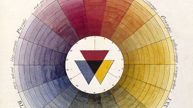
I may not be the best person to judge the worth of an exhibition called Making Colour, just opened at the National Gallery. I have a lot of preconceptions about colour in painting, particularly, the way that colour should and shouldn’t be discussed in the description and analysis of painting. I am also always skeptical of the National Gallery’s reorganization of its own paintings into a special exhibition that then costs anything between £8-£15 to enter. And an exhibition such as Making Colour seems to be summer filler, in between Veronese and Rembrandt whose late works are on display in the Autumn. So take what I have to say with all precaution.
Sassoferrato, The Virgin in Prayer, 1640-50
Making Colour is really just that: an exhibition about the way that artists in the late medieval, through the Renaissance and into early modernism, made colour.  Blue, green, yellow, red, purple, gold and silver are each given a room in the downstairs five galleries. There is all sorts of interesting information on how colour pigments were made, the search for stable colours, the introduction of manufactured colours in the nineteenth century, how to make gold leaf, and Queen Victoria’s penchant for purple. If you don't know a lot about colour, the exhibition will help to see painting through this lens in a new light. It encourages viewers to look at the very technical aspects of colour manipulation on the artist’s palette and the canvas.

Michael Pacher, The Virgin and Child Enthroned with Angels and Saints, 1475
My disappointment in the exhibition came because it was about nothing other than the technical aspects of making colour. There was no mention of the political value of lapis lazuli, for example. The patron’s struggle for recognition, his flaunted wealth through the use and amount of blue; the association of blue with capitalism, with ownership, with power and the competition between painted blue and the great expanses of nature – the sky, the sea. None of this was even hinted at in the room devoted to blue. There was discussion of the development of certain colours, but only from a technical perspective, namely to find stable pigments. None of the factors other than the technical that influenced colour, its fabrication, its thematic and formal uses were mentioned. For example, the historical demands, economic demands that drove the pursuit for colour were overlooked. Similarly, there was very little discussion of gums, resins, lacquers, tempera and oil, and how the mixing of colour with these substances was so key to the development and use of certain colours and dyes at certain historical moments.
Edgar Degas, Combing the Hair, 1896

The other thing about the exhibition that I found a little gratuitous was that the paintings were all hung as mere illustration of who used what colour and when. The aesthetic value of the paintings was completely erased in preference for a focus on the fact that blue, green, red and so on, were used to depict a given object or scene. I say this and yet, there were a few exceptions to this, but I wonder if my noticing of the aesthetic or painterly techniques was because for some of those on display, it’s impossible not to see them as much more than the sum of the colours used. For example, to look at Botticelli and not see magnificence and exquisiteness would be so contrary to instinct that I can’t imagine it happening. His Saint Francis of Assisi with Angels, c. 1475-80 is on exhibition in Making Colour, and it reminded me that sometimes the National Gallery’s showcasing of its own paintings out of their aesthetic or historical context can bring lovely surprises. If this painting has been on display at the National Gallery, I have never seen it, so the fact that it is included in Making Colour was a redeeming feature of the exhibition.