Sunday, June 25, 2017

Matière Grise @ Galerie Max Hetzler, Paris

Raymond Hains, Untitled, 1990
Albert Oehlen’s Untitled, 2017, commissioned for this exhibition, dispels all doubt about the ambiguity of grey. The colour chart that moves from what we might call grey to blue to brown to white showing that, in fact, any colour might be grey if seen in the right light. And vice versa, grey can become any other colour if seen from a given perspective, by a particular culture, in a specific historical moment. As Wittgenstein reminds us, we call grey, like all other colours, is always at the mercy of language, the words that we give to that peculiar cast of light on the surface before our eyes. I have no idea if it is Oehlen’s intention to cast the definition of grey into question, but this is what came to mind as I stood before this work that seems unrelated to everything he has done until now. While the form of the colour chart is nothing new—and visitors will be reminded of Gerhard Richter’s works of the same genre—its placement here at the entrance to Matière Grise as a claim about grey, is innovative.
Albert Oehlen, Untitled, 2017
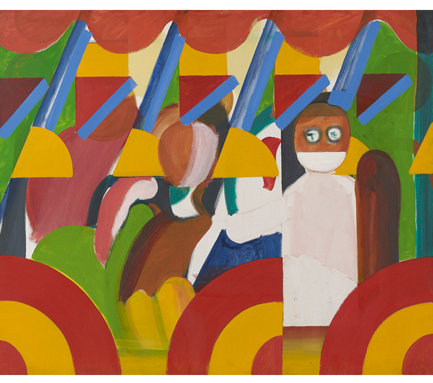
The exhibition confirms all my convictions that grey is the most exciting colour. While each work on exhibition has some kind of value, the curation is what makes this show fascinating. Matière Grise brings together all of the materials in our world that are grey: steel, clay, oil, spray paint on cars, aluminium, charcoal and of course, paint. The exhibition consists of pieces ranging from Raymond Hains, Untitled (1990) made up of posters torn from the streets stuck on stainless steel, through Edmund de Waal’s still life of a pot, a book with a gold leaf leaning against it inside a small box, to a rock by Navid Nuur, enamelled and with indentations in which iron shavings are nestled. All of this matter is grey, and together, they remind us that grey matters.
 
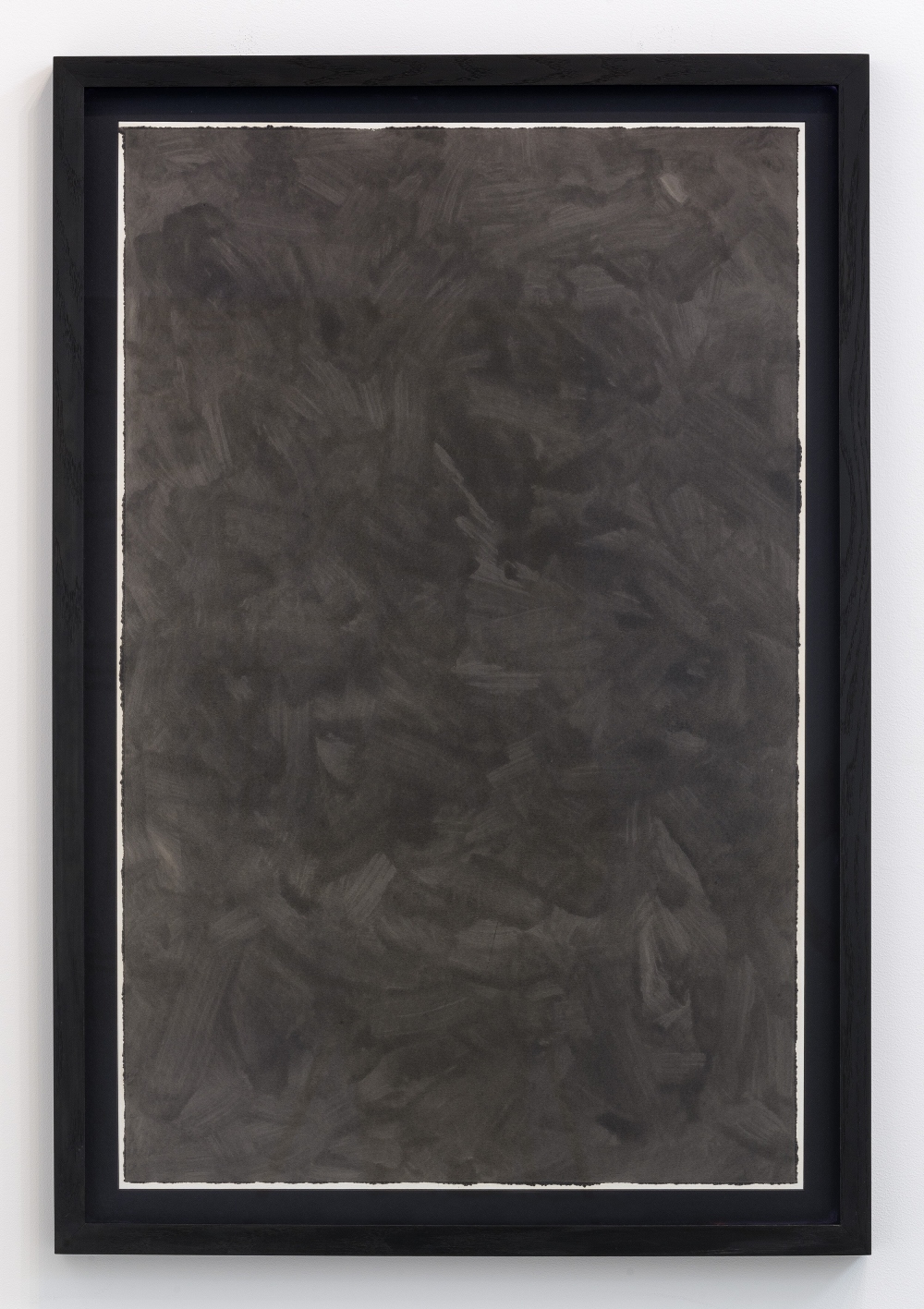
Loris Gréaud, Trajectories, 2017
My favourite of the individual pieces is Loris Gréaud’s Trajectories, 2017.  Car waste oil has been smeared across absorbent paper, mounted and framed in black oak. The bevelled edges of the paper which is mounted on board and then made precious through a frame. The unevenness of the paper on which the oil is smeared thus becomes foregrounded and similarly makes the oil as medium poetic. The oil raises many associations; the cars from which it has been wasted, the environment from which it has robbed, the economy it turns around, remind us that oil is such a politically and economically potent substance. And here, in Trajectories, oil makes paper sensuous and aesthetically pleasing, and in turn, delicate.
Jérémy Demester, Vin d'Anjou IX, 2017
It is interesting to note that all the pieces are abstract, and all are tactile, material and or sumptuous surfaces. And like Trajectories they all engage some form of transformation, either of the material or the grey. Each piece therefore reflects back on the colour grey. The shiny reflective surface of Jérémy Demester’s, Vin d’Anjoy IX, 2017 is hung opposite Gréaud’s Trajectories and looks blue by comparison, across the other side of the room. The two are in conversation, reflecting on their differences—reflective opposite absorbent—and through juxtaposition, their own materiality. In this example, we see how grey has the capacity to make ethereal substances material—oil, water, air, and of course, paint are made into things, distinct, but dependent on each other for definition. We see this transformation, literally, in the fourth panel of Hains’ Untitled. A horizontal blue line about 1/3 of the way down the panel turns blu paint into water, a substance. Materiality is also the conversation had by the objects of de Waal’s Tobias and his angel (2017): the objects in the box are ceramic, graphite, glass, aluminium, plexiglass, and all come together to transcend their individual identity and significance.
Günter Förg, Untitled, 2001
The question I came away with: why is it that grey is always rendered through abstraction? I don’t know the definitive answer, but I am convinced that artists turn to grey to pose the questions and problems that preoccupy, but cannot be examined through representation. Grey is a stripping back of the concerns of the aesthetic, and therefore, questions are resolved in grey where other colours have no idea. Thus, Günther Förg’s ribbons of dark grey on a lighter grey background ask questions about background and foreground, the difference between line and ground, between chaos and order, labyrinthine possibilities.

My commitment to grey stems from the fact that grey has to work with other colours, in different materials in order for its brilliance to shine through. Grey doesn’t have an easy life. And this exhibition is memorable because it is only in the coming together of the different works that all of this magic happens in the Max Hetzler gallery.


All images copyright Max Hetzler Gallery

Sunday, June 18, 2017

Lucio Fontana Crosses @ Galerie Karsten Greve


In yet another stunning exhibition at Karsten Greve’s corner gallery in the Marais, Lucio Fontana’s ceramic Crosses are strangely sublime. In keeping with my commitment to a modernist aesthetic, I have always been more interested in Fontana’s renowned defacement of the painted canvas than his ceramics. However, at the 2014 exhibition at the Musée d’Art Moderne de la Ville de Paris I realized that painting was more than it appeared thanks to the emphasis on the three dimensionality of the “cut canvases.” Even though the ceramic crosses appear very different from the cut canvases, this dimensionality and spatial articulation is clearly consistent between the two forms.


Here at the Karsten Greve exhibition, I discovered a delicate desecration of a different kind. The ceramics of Christ on the cross, in some cases Christ without a cross, and in others, crosses without Christ are beautiful and, of course, because they represent the sacrificial, they are painful. The contorted body of Christ is, like the misshapen cross with which he merges, hand moulded and fired such that the two verge into abstract form and emotional expression. The coming together of these two incompatible modes makes the pieces unusual and simultaneously exciting.

 
The surface of each piece is sumptuous, and the colour is surprising; where green turns into gold which turns into red and blue, the forms become ethereal, like fabric blowing in the wind rather than handmade ceramic sculptures. The materiality of the pieces is smooth so that it’s difficult to resist the temptation to run our fingers across the smooth, delicate surface, to feel this complex object that leaves behind a shadow as it seems to fly off the wall. We can see and want to trace the curves left by Fontana as he has moulded the clay, and left the edges as if suspended in midair. We can feel the indentations left by his fingers, the piece of clay stretched out to become a hand begging for mercy, a torso writhing in pain, a head bowed exhaustion. Even though the form is abstract, we have no difficulty finding the body and emotions of Christ.


One of the most curious aspects of the ceramic sculptures is their size; on the clean white walls of the gallery they appeared tiny. Their size makes them delicate, and somehow contributes to the pain as the expression given to the murdered Christ. As I walked around, I wondered if they could be religious? They are, after all, crucifixions. But, I am not sure they are any more sacred than Pasolini’s The Gospel According to Saint Matthew (1964)a film more interested in the social and ideological ramifications of power and sacrifice than it is in the biblical story. However, unlike Pasolini, Fontana doesn’t seem to be criticizing the church and its want to hang people on crosses. Rather, it’s as though Fontana uses the subject matter of the bible and its history as a vehicle for his concern with the use of art and colour to express the inexpressible. These fine works are perhaps best understood as artistic expressions of extreme emotion.  


Tuesday, June 13, 2017

Howard Hodgkin, Absent Friends @ National Portrait Gallery

Howard Hodgkin, Absent Friends, 2000-2001
I imagined many visitors to the Howard Hodgkin exhibition at the National Portrait Gallery would be bemused by the claim that the works in display are actually portraits. My favorite piece in the exhibition consisted of two think brushstrokes in two shades of blue on a wooden support. How, I wondered, would that be seen as a portrait? Nothing about it resembled a replication of the human face. But the few people who shared this wonderful exhibition with me were much more art savvy and sympathetic than I had anticipated. All of which is to say, this is not a summer blockbuster. The National Portrait Gallery doesn’t bill it as such, but rather, but it is for the well-trained art viewer.
Howard Hodgkin, The Tilsons, 1965-67
Even though my expectations of the work were not so high, it still took me some time to get into the paintings. The opening image, Absent Friends (2000-2001)) which gives the exhibition its title, consisting of a handful of abstract earth colored brushstrokes, horizontally wavering across the canvas. The painting was contemplative and generous in its reflection on and memory of lost loved ones. But then, with the beginning of the exhibition proper we are taken back to Hodgkin’s early portraits. Like most young painters, the early work is heavily influenced by what is in his environment: most notably, the traces of German expressionism and, a little later, the postwar abstraction of Francis Bacon and Lucien Freud, followed by pop art. As he searches for his own style and visual language, Hodgkin’s work is not yet compelling.
Howard Hodgkin, Going for a Walk with Andrew,  1995-98
When Hodgkin comes into his own around the 1960s, he begins to do something quite unique in painting. Not only does he lead portraiture away from the human figure, to the point where in most of the works, the semblance of a face is nowhere to be found. But perhaps more profoundly, he finds the self and its identity in color and the variations of his visual language. Dots, lines, long brushstrokes become the expression of emotions, and atmosphere. The spatial organization of the image, together with the exciting colors, carry the revelations of identity and character. I don’t know another abstract painter who does this.  

Howard Hodgkin, Waking up in Naples, 1980-84
The colors in the substantial middle period (my categorization) move from psychadelic oranges and blues to muted earth tones. Even though the paintings are given the title of a person’s name, it doesn’t seem as though the physical person matters. What matters to Hodgkin is the memory of the emotions he experienced when he first saw the person. Or, in a painting titled, Waking up in Naples (1980-84), I imagine that the oranges and blues might be the world around the figure – the sea and the brilliant red sun setting on the Mediterranean coast. It could of course also represent the intensity of emotion that Hodgkin experienced when he saw the woman in the morning. However, we interpret them, these are not portraits that give any insight into the sitter. They do of course, reveal much about the artist and his concerns and preoccupations.
Howard Hodgkin, Souvenirs, 1984
One of the most interesting is his ongoing exploration of the object of painting. Throughout the exhibition, we see his use of the frame as a canvas for a vision that cannot be easily contained. Alternatively, layers of paint on Souvenirs, 1984, becomes a series of curtains or masks over the painting itself. It is as though the dots are a veil over the painting, hiding and the recoil from revelation to the world. In this way, painting itself might be said to be the sitter in these works.
Howard Hodgkin, Blue Portrait, 2011
As he gets older, the paint becomes looser, the abstraction becomes more intense, until the most provocative image: Blue Portrait (2011), a few broad blue brushstrokes on wood. The painting is said to catch a fleeting moment in which Selina Fellows appeared at the bar in a blue dress at an opening of his exhibition at the Centro de Arte Reina Sofia. To me it captures the abstract, aleatory nature of memory in its often nonsensical play with the world of reality. The small painting is tender and playful, whimsical and melancholic, all at the same time. Such complex expression of emotion, together with bold colors and elusive meaning, make these portraits unique among the work of his British compatriots in the 20th century.