Sunday, November 26, 2017

Monochrome. Painting in Black and White @ National Gallery, London

Jean-Auguste Dominique Ingres, Odalisque in Grisaille, c. 1824-34
This small exhibition in the National Gallery’s temporary exhibition space is both exquisite and somewhat perplexing. It is a treat to see some of the precious paintings on display, many of which I have not seen in exhibition before. However, there is not much coherence to the works that are displayed in roughly—though not consistently—chronological order.

Image result for stained glass panel with quarries and a female head
Stained Glass Panel with Quarries and a Female Head, c. 1320-24
On entering, we recognize that Monochrome. Painting in Black and White is an exhibition of works that are not all painted, neither are they all black and white, nor are they consistently monochrome. Thus, if the somewhat misleading title is not the point of coherence, what is? Unfortunately, the colour itself does not create strict continuity, because grey comes in so many different shades, tones and hues. In addition to the fact that the works are not all black, white and/or grey, and very few are monochrome, it becomes obvious as we walk around that colour itself is unreliable. Thus, one of the most extraordinary works on display is the Genoa altarcloth, Agony in the Garden, 1538 which is, in fact, oil on blue linen. And the porcelain skin on the back of one of the most famous grey paintings, Ingres’s Odalisque in Grisaille (c. 1824-34), is highlighted in shades of red. Indeed, it’s highly unusual to find paintings that are entirely executed in a grey palette. And of course, this is what makes grey (as opposed to black and white) fascinating: grey is always shifting to the human eye, often because it is mixed with other colours, and even when it is on the scale between black and white, it is never a singular.
 
Josef Albers, Study for Homage to the Square, 1965
Thus, in another painting that is central to the history of grey painting, Josef Albers’s Study for Homage to the Square (1965), the interest of the work is compromised because it sits on a wall by itself. The point of Albers’s colour studies is to highlight the optical effects of the area covered by a colour and its interaction with that surrounding it, next to it, or behind it. That is, we see the individual grey squares as different sizes depending on what is next to them. And when there is only one study as there is here, the comparative effect is lost on the viewer.
Image result for mantegna the introduction of the cult of cybele in rome
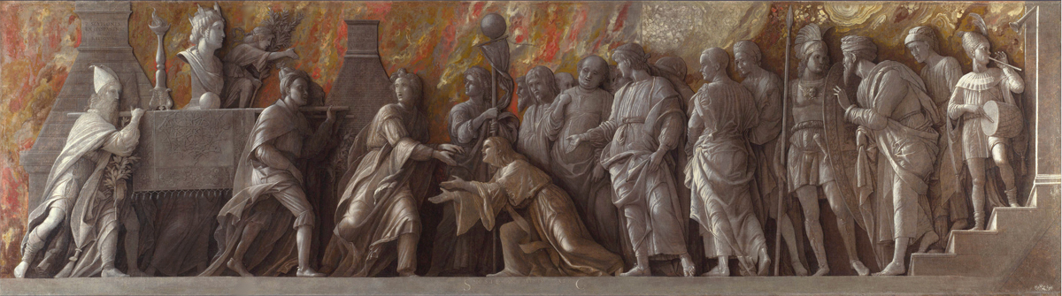
Andrea Mantegna, The Introduction of the Cult of Cybele at Rome, 1505-06

And what of the different media that are displayed?  It’s clear to me why the curators have chosen works in glass, metalpoint, ink, pen and engraving. Because these were the media used for some of the developments in grey, black and white image making from the Renaissance on. However, the rationale for the inclusion of prints is never made clear to the visitor.  Which is not to detract from the fact that there are some marvellous works—including a stained glass panel from 1320. However, together with the diversity and historical reach of the exhibition, these examples muddy rather than clarify the larger perspective.
Frank Stella, Tomlinson Court Park I, 1959
The final room has at its centre Malevich’s Black Square (another of the gallery’s great coups on loan from the Tretyakov Gallery in Moscow). The Black Square was among the paintings that changed the course of Western art history in 1929. Here in the final room, focused on the theme of “Abstraction in Black and White,” opposite Malevich is a minor Jasper Johns painting, and it is surrounded by works as varied as Stella’s Tomlinson Court Park I (1959), two Cy Twomblys, Bridget Riley’s Horizonatal Vibration (1961) and others. It is thus centrally placed, but its influence is lost because it is surrounded by works that are only related by their colour palettes.

Ultimately, while the exhibition is to be applauded for bringing these works together, and for shining the spotlight on black, white, grey, blue and brown, it would have been lovely if it had given a sense of what is so special and intriguing about these colours. More coherence and logic would have gone some way to showing us why we should care about them. 

Monday, November 20, 2017

Hiroshi Sugimoto, Surface Tension @ Marian Goodman, Paris Gallery

Hiroshi Sugimoto Surface Tension installation @ Marian Goodman Gallery
Standing in Marian Goodman's Marais Gallery for Sugimoto's Surface Tension exhibition, we forget we are in darkness because the light emanating from the photographs (as well as the spotlights shining on them) makes the space luminescent. It’s as difficult to describe the endless fascination of these photographs of a single subject as it is to explain how photographs in the dark can give off the impression of being in a light filled room. So you will have to believe me when I say that this exhibition is a never-ending narrative of surprise.

Hiroshi Sugimoto Surface Tension installation @ Marian Goodman Gallery
Seeing this many of Sugimoto’s seascape photographs together in one space changes everything. It changes the way that we look at his photography, it changes the way that we see the world, it changes the way that we understand photography. These photographs of seascapes in which the sky can be a leaden black weight on a fragile sea, or sea and sky can be indistinguishable expanses of white, open up everything we thought we knew about the sea.  I even suspect this might be one of those exhibitions that change our expectations of what art does.
Hiroshi Sugimoto Surface Tension installation @ Marian Goodman Gallery
So what do we see? It’s the same image over and over again of the sea, the sky and the horizon line shot over time at different locations around the world over a number of years. The form of the image is always the same with the horizon running exactly midway through the photographic composition. Sugimoto photographs every sea across the world; the Pacific Ocean, the Celtic Sea, the Tasman Sea, the Sagami Sea and the Aegean Sea being some of those pictured in the exhibition. And although it's always the sea, each sea and each image is also different. What we see is the sea in its infinity, proliferating and reaching into infinity, endlessly transformed by the weather, the light, the location and from photograph to photograph in the exhibition. The sea is never the same, ever. Sugimoto’s form of repetition that never repeats pushes the photograph to its limits of abstraction. Over time with these images it doesn’t matter where they are taken because they tell nothing of the place itself. They become self-enclosed abstract worlds of their own that refer only to the sea in another abstract, unlocatable place.
Hiroshi Sugimoto Surface Tension installation @ Marian Goodman Gallery
 Sugimoto’s seascapes draw our attention to the horizon as the most mysterious and enigmatic of “objects” or phenomena. It can be a clearly defined line between sky and sea, or erased by the haze of the air, but whichever form it takes, the human eye is unable to see and to hold the line of the horizon. And because Sugimoto has removed all familiar markers – perhaps a gull in the sky, a cloud passing by, a ship, or even waves on the ocean — means that we have no access to the sea, the sky and the horizon. Nothing on either side of the horizon helps us to grasp what is in the image. We are left with wild and overwhelming visions of a phenomenon that cannot be controlled or ever fully understood by our eye. In this sense, photography would seem to be the exact wrong medium to capture the sea. Because the sea is constantly evading the eye, even that of the camera, while photography wears its capacity to capture on its surface.
Image result for sugimoto seascapes
Hiroshi Sugimoto, Carribian Sea Jamaica, 1980
It’s not just photography that is challenged in the seascapes; indeed, one might argue that, Sugimoto is doing the work of contemporary painting. The photographs over time are less about photography than they become a struggle or negotiation with the questions of painting – texture, tone, hue, light and the unreliability of vision. The sea has fascinated painters throughout history, and particularly in modern times. From Casper David Friedrich’s distant, ethereal bodies of water to the churned-up emotions of J M W Turner’s stormy seas, painters have sought to explore their age and their medium through depictions of the sea. In its multiple and infinite variations, in the light of the moon, the sun, under clouds, in rain, at night and during the day, Sugimoto’s manipulated seas start to bear the brushstrokes of painting. I am not the first to see Rothko in these seas, and indeed, the connections to late 20th century abstract painting are everywhere. The concerns of Sugimoto’s seascapes are the same as those of his colleagues working in paint. To give one example, the horizon is always dead centre, but it appears to be in different places depending on the light during the day or night, the weather, the latitude and longitude of the location. Thus, the images become also about optical illusion, the forces on our vision, and our resultant willingness to submit to the manipulation of the image (and the sea). Accordingly, we might say that the sea in Sugimoto’s photographs comes to teach us even more than can be imagined. We even learn about our own limitations, particularly, the limitations of our physical vision, but also, our willingness to be deceived by an illusion.