Saturday, August 31, 2019

Michael Craig-Martin @ Gagosian Britannia Street, London

michael craig martin sculpture gagosian london exhibition sculptures artworks
Michael Craig-Martin
Installation View @ Gagosian Gallery London
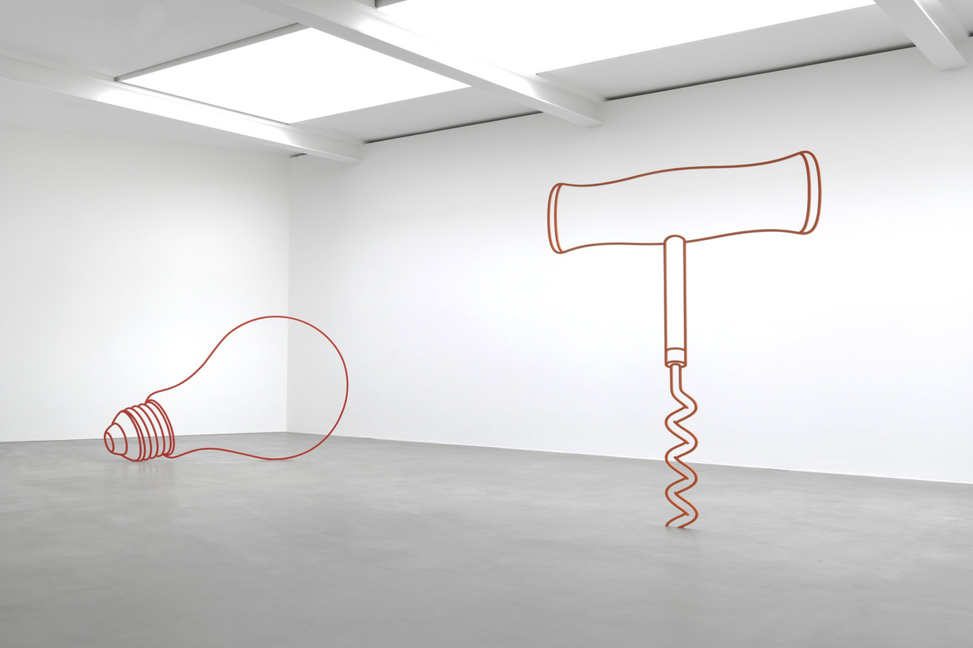
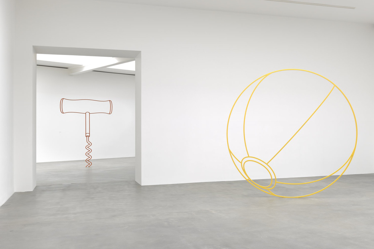
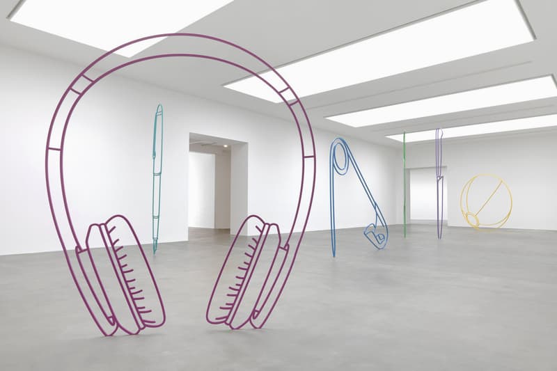
This exhibition sees Michael Craig-Martin's oversized steel object outlines indoors for the first time. The multi-colored works gleam brightly in Gagosian's King's Cross spare white warehouse space. Reviewers of the exhibition were disappointed that Craig-Martin did very little new. However, as I was previously only familiar with his paintings, I found the sculptures intriguing. It's difficult to describe them. The gallery blurb calls them monumental, but that doesn't capture their delicacy and technical precision. I prefer to call them outlines in steel of household objects. They embody none of the complex meanings of monumentality as a term, and indeed, are doing something different from sculpture as we know it in the public realm.

michael craig martin sculpture gagosian london exhibition sculptures artworks
Michael Craig-Martin 
Installation View @ Gagosian Gallery London
I was fascinated by the fact that the objects made of steel stood without other support on their almost razor thin edges. My first thought on entering the space was that the works must be about balance. Then, the fact that they are made of steel, one of the most hardy and stalwart materials of the twentieth century gave them a nice irony. And, my next question was, why did the artist use steel? What does steel enable the objects to do that other materials wouldn't?  These are hard edged, potentially gaudy, not quite replicas of household objects.  When we look at them they are two dimensional, like coloured drawings. Then as we approach, we find we can also walk through them, suggesting that they create multi-dimensional space. They themselves may not have dimensionality, but they are representations of three-dimensional objects that mark out three-dimensional spaces we inhabit. Thus, their illusory quality adds another level of irony. Lastly, and perhaps their most intriguing quality: the works are sculptures as oversized representations of something else (household objects), taking them into discourses of monuments. And yet, they completely undo all references to monumentality thanks to their hollowness and their two-dimensionality. Effecrtively, the works are both representations and not representations.
Michael Craig-Martin: Sculpture review
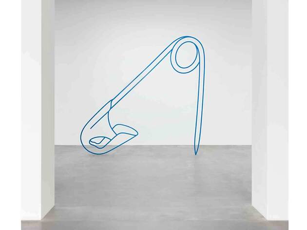
Michael Craig-Martin, Safety-Pin, 2019
The sculptures speak about the uselessness of art, and though we desire to do something with them - walk through them, look at them and make sense of them, the objects are also useless. They could not be used as a safety-pin, an umbrella, a corkscrew and so on. As works of art, for all these reasons, they are simultaneously sculptural representations and abstract. In addition, the pretty colours make them delicious to look at, creating or perhaps speaking about the desire for the object to be consumed.
michael craig martin sculpture gagosian london exhibition sculptures artworks
Michael Craig-Martin, Installation view @ Gagosian
Apparently, the same kind of works have been installed outdoors on the grounds of gentry estate complexes. They have been placed in the gardens such that they become extremely disruptive because, first, they are oversized and these stately gardens are always made in an era when everything is designed to be the size of the human. And second, Craig-Martin's sculptures are exaggerated contemporary where all the other additions to such gardens are always old and weathered. The colours, the size, the steel material, everything about them is wrong for the environment. By comparison, in the gallery space they don't necessarily dialogue with their environment or each other, but rather, speak more to concepts of sculpture, painting and drawing. 


Sunday, August 25, 2019

Cindy Sherman @ National Portrait Gallery, London

Cindy Sherman, Untitled Film Still, #54, 1980
As an art history student in the early1990s, I thought Cindy Sherman’s Film Stills were brilliant in their conceit and their critique of the movie star images of women that we were still unconsciously devouring. Their unsettling confrontation of our gaze, the framing and composition that makes everything not quite right, and the ambiguous narratives they incite in our minds, underly endlessly fascinating photographs. And no one else was doing quite the same thing in the 1970s and 1980s. Wandering through the current exhibition at the National Portrait Gallery in London, I couldn’t help thinking that the Untitled Film Stills were still, all these years later, among Sherman’s most astute and provocative images.
 
Cindy Sherman, Untitled #479, 1975
It’s a lot to ask an artist who had so much success early in her career to keep producing work at the cutting edge of her chosen medium. Sherman has done this to varying degrees of success. Of course, all her work has been celebrated, but I am not convinced that it all warrants the same levels of applause. What makes the early film stills so brilliant is their multiple meanings and multiple suggestions. It’s not simply that the figure becomes androgynous, or the woman looks back, or the body has been cut off by the side of the frame. For us as viewers, their challenge is often that they are playful and funny and critical and compassionate all at the same time. The end result is that we don’t quite know how we are being asked to respond, and indeed, if our instinctive response is appropriate. This level of density is difficult to sustain, and as I say, she doesn’t always achieve it.
Image result for cindy sherman fashion series 122
Cindy Sherman, Untitled, #122, 1983
That said, in a disturbing series where she does succeed, Sherman was commissioned to produce centerfolds for fashion magazines. Her way of critiquing the glamour and false notions of beauty propagated by the industry—and happily consumed by us—was to masquerade as angry, down and out, face-lifted and depressed women. Thus, the very companies that commissioned her work come under fire for their absurdist notions of beauty, elegance and the desirability of women. We see figures displaying unseemly emotions in oversized, confrontational images, leaving us no choice but to question our own desire to look. Ironically, we admire the clothes of these same figures who are dressed in a fine Comme des Garçons suit, or an exquisite Balenciaga dress. Unnervingly, with their slick photographic surfaces, rich colors, and desirable clothes, the images are sumptuous and it's difficult not to keep looking. Until, of course, we recognize that we are also the very problem Sherman is critiquing in the negative performance of the fashion industry.

Cindy Sherman, Untitled #250, 1992
In some of the most powerful works on display, Sherman makes a series of macabre sex scenes that verge into pornography. In a clear reference to the surrealist works of Hans Bellmer, Sherman uses dolls, masks and medical prostheses to create disturbing, impossible figures in poses that make us recoil. Even though they are dolls, I found myself responding to the figures as though they were people. They had the same effect as cartoons – we give them emotions, and human qualities, even when they comprise horrific details such as sausages coming out of a man’s vagina. It’s this ability to shift her viewer between laughter and horror, squeamishness and intellectual curiosity that makes Sherman’s work powerful.
 
Cindy Sherman, Untitled #92, 1981
If the genre of portraiture has conventionally been used to represent identity, to flaunt the wealth and social status of the sitter, to record and pay homage to the powerful—I think here of Popes and Kings—Sherman turns the genre inside out. Like mirrors to our own desire for identity, or admiration of power and status, Sherman exploits the portrait to expose our subconscious role in posing and looking at portraits. We see women in distress, anxiety ridden heroines, performing for their audience, but yet, deeply uncomfortable at being looked at. Effectively, Sherman uses her own face and body in photographs to show women in all different states of social grooming, to represent a portrait of the way that we see and represent women. Thus, her work is not just about the world we live in, but the way we imagine that world to be, as it is envisioned through the material and mental images of women.
Cindy Sherman, Untitled, #574, 2016
Lastly, seeing the work in this retrospective format gives insight into how Sherman continues to re-invent her work. So much of her ability to do this grows from her full embrace of the technology of photography. In the early works, the medium and her process is often present in the image – in the student works we see the lead presumably from the camera to her foot where she must have stood on a switch to trigger the shutter. In her most recent works, the overt foregrounding of the use of digital manipulation through separation of back projection and figure—to the point where in images such as Untitled, #574, the figure could be a cardboard cut out. This exploitation of the technology of photography to produce multiple Cindy Sherman’s in a single shot, of for example, to create self-conscious illusion, both critiques the medium that is her vehicle and successfully pushes her work into new and ever more provocative areas.


Tuesday, August 13, 2019

Bernard Frize, Sans Repentir au Centre Pompidou

Bernard Frize, Oma, 2007
Bernard Frize: Without Remorse in the street level gallery space at the Centre Pompidou gives a substantial overview of the contemporary French painter’s oeuvre. As I wandered around, I wasn’t always convinced, unable to decide if the works were serious and substantial, or gimmicky and superficial. But the more I think about them, the more I want to keep thinking. The first thing we notice about Frize’s compelling paintings is their sleek, shiny finish. Through a process of mixing paint and a lacquer-like resin, the porosity of the canvas is sealed and the gesture of the painter’s brush ostensibly lost to the surface. The end result are works look that look more like paint on a metal support than acrylics on canvas.
 
Bernard Frize, Rassemblement5, 2003
One of the most intriguing aspects is that the paintings are extremely difficult to penetrate. They are filled with pretty colours, and therefore, very pleasing to the eye, very easy to look at. But lingering in front of them, ironically, leads frustration. This is partly due to the hardness of the reflective finish, making them cold and completely without depth, thus not inviting contemplation of any sort.  But it is also about the fact that the image reminds those of us with a desire for order and logic of a geometrical or mathematical puzzle. Frize’s process of production – which the text accompanying the exhibition focuses on, perhaps to the exclusion of other important details – is to fill one or multiple brushes with paint and then move around the canvas in a single stroke. Sometimes, Frize works with up to six people all with multiple brushes doing the same thing. Thus, our first response to the work is to use our eye to follow the movement or performance of the artist/s with their brushes before us, twisting and turning our gaze to follow the maze like patterns around the canvas. Then, all of a sudden, our eye hits a clear break in the flow of the brushes and we have to start all over again. This process of discovering patterns in the strokes, only to be frustrated, disappointed, or to find the logic disintegrate altogether, sent me moving to the next canvas in hope that I could find coherence there.
 
Bernard Frize, 80F, 1991
Alternatively, in a work such as Oma (2007) in which spray painted lines looking like a gridded representation of the metro map lead our eyes through a never ending maze of tunnels and secret passages, with one color turning into another, taking over the journey. But we can’t stay on the grid for long because the blurring of the lines and the resultant haze over the image are incompatible with our need for clarity and precision, for sense and reason. And so we keep moving.
 
Bernard Frize, Suite Segond LD, 1980
Detail
Because of this difficulty of looking at otherwise very beautiful abstract paintings, I am beginning to enjoy Frize’s work more since I left the exhibition. Thinking back, Frize is doing many interesting things with painting as a measure of time, painting as a measure of the density of color on the end of a brush, the forces of gravity as they influence and form the unpredictability of movement of paint around a canvas. He is also playing with ideas of artistic originality, and testing the expectations we bring to painting, and the desires we project onto it. In addition, the works raise issues such as what happens with the collision of colours by accident or intention as they have moved around the painted canvas over centuries.  
 
Bernard Frize, Sans Titre, 1986
Lastly, the catalogue essays make interesting connections to other paintings from Chardin’s exquisite representation of the soap bubble’s reflective surface to Barnett Newman’s rearrangement of the focus of the image in his paintings. I am sure Frize has many influences, and there’s no doubt that the work engages the history of painting, particularly postwar American abstraction in interesting ways. On the level of process, application, and the unpredictable movement of paint when it is pushed around a canvas, there must be infinite connections. However, it’s also quite possible to enjoy the games Frize’s invites us to play with paintings that always outsmart us. I am now convinced enough that I will visit the concurrent exhibition of Frize’s painting at Galerie Perrotin in the Marais.

Saturday, August 10, 2019

Werk ohne Autor, Florian Henckel von Donnersmarck, 2018


A number of people have asked me over the past weeks if I have seen the “film about Gerhard Richter.” Having read the article about the film and its maker in the New Yorker some months ago, I was not expecting a film about Gerhard Richter, and had all but forgotten it until everyone started asking me. Encouraged by one of my film scholar friends, I thought maybe I should see Werke ohne Autor. I dutifully sat through over three hours of film in the middle of the heatwave, thinking at least I would be in the air-conditioning for a night. To be honest, there are few other reasons to see the film, and little to recommend it.

Werk Ohne Autor is not a particularly good film, it’s not a particularly interesting film, and it’s certainly not the kind of film that I am drawn to write on. Far from it. That said, I feel compelled to set the record straight about the film’s relationship to Gerhard Richter. Yes, it makes obvious references to the work and life of the artist, but I can’t imagine anyone interested in his work, or painting in general, or film as an art form for that matter, having any interest in Werk ohne Autor.

Before I elaborate, there was one scene I really loved. At the beginning of the second part (it was shown in two parts here in France), the young protagonist attends an open day at the Düsseldorf Art Academy in 1961. As the young man is guided by a would be fellow student through studios filled with paintings, sculptures, happenings and installations, we get a sense of the radicality of the Academy under Joseph Beuys at this time. The protagonist has been in East Germany, painting Socialist Realist murals, and as he steps into the Düsseldorf Art Academy, we see the weird and wonderful experiments of art students without limitations. The sense of excitement and possibility that is so diametrically opposed to art education in the Soviet sector of Germany in the immediate post war years is vividly captured in this one sequence. The striking contrast reminded me of how artists such as Beuys and later Richter, and for example, Sigmar Polke, really did change the face of modern art in their day.

This one sequence aside, much about the film irritated me, including the love story, the use of the child’s deliberate blurring of his vision as a preface to what we know will be a reference to Richter’s blurred paintings in later life. The idea that a particular moment in the young Richter’s life, or a particular way of seeing things somehow causally informed the photo-paintings is, of course, anathema to Richter’s whole aesthetic. The opportunistic use of events from Gerhard Richter’s life—such as the bombing of Dresden, his Aunt’s murder by the Nazis, and so on—blown up to become causal explanations of the main character’s artistic journey is, in fact, offensive. Even to call it an artistic journey is giving the film too much credit, because there is no real character development: the protagonist goes form painting benign and meaningless marks on a canvas to deeply emotional, profound images of German history – lifted from Richter’s own oeuvre – overnight. To be sure the whole film will grate on the nerves of anyone who knows anything about film, whether or not they know anything about Richter’s life and artistic development.

Even though the film liberally borrows some details from Richter’s life and totally misinterprets others, Werk Ohne Autor has nothing to do with Richter. In reality, the aesthetic, sensibility and interpretation of Richter’s oeuvre and individual works are built on ambiguity and continual evasion. These qualities have been reinforced by the artist’s reticence to talk about his work over a lifetime. All in all, Werk Ohne Autor with its romance, drama, feel good music and cause an effect narrative not only has little integrity as a film, but it has nothing to do with Richter’s life or his painting.   

Friday, August 9, 2019

Berthe Morisot @ Musée d'Orsay

Berthe Morisot, Young Woman in Grey Reclining, 1879

This lovely exhibition at the Musée d’Orsay is a summer crowd pleaser. It’s one of the most coherent exhibitions I have seen this year, has great appeal for tourists looking for Impressionist colour and light, and opens new horizons for art historians and critics. I do have one small issue though; its installation upstairs in the first floor corridor galleries that don’t all connect to one another. The exhibition in multiple single entry rooms interrupts the flow as we have to go in and out of the exhibition. Otherwise, it’s a delight
 
Berthe Morisot, Cousant dans le Jardin, 1881
Of course, the thing on our minds as we enter the exhibition is gender. Few people know Morisot’s work because, together with Mary Cassatt, she was a woman. Everyone knows Renoir, Monet, Manet and Degas, and perhaps other of the male Impressionist painters. However, Morisot was all but forgotten by history until Linda Nochlin revived interest in the 1990s. It’s worth noting that Morisot was selected for exhibition in the Salon from 1864 onwards, giving her some success in her lifetime. But critics dismissed her as amateurish and confused, particularly on account of her tendency to leave areas of the canvas without paint. Much is made of this by the exhibition text, but we will also remember that the male Impressionists were also rejected at the time for their then radical approaches to the canvas. So it’s not exactly correct to claim that her work was rejected on account of her gender, even if that’s what critics claimed. Nevertheless, visitors to the Musée d’Orsay will discover why the very qualities that early critics identified as evidence of her uncertainty and lack of skill are in fact indications of her control over the canvas and subject matter. The empty space of works such as Cousant dans le Jardin (1881) give a sense of looking through a keyhole at a moment in time. And in others, the centrality of the figure creates an intensity to the paint and the depiction which becomes amplified by the empty edges.   
 
Berthe Morisot, En Angleterre, 1875
For me, the most impressive paintings were those using mirrors and windows. For Morisot, as for many of her Impressionist brothers, there is a full flattening out of the canvas. She does this by using fabrics and clothes to close down space of the room, where dresses become indistinguishable from sofas and curtains continuous with the walls behind them. Similarly, the space is often framed so that we don’t see the edges of the room, and outdoors, we see no sky. Rather, the space is shut down by the sides of the frame. Morisot goes one step further when she adds mirrors and windows that both extend the spaces outwards, and yet, reflect back on themselves. Thus in an image such as En Angleterre (Eugène Manet à Isle de Wight), 1875, the man is caged by the window as he looks out to the harbour. At the same time, the woman and child on the other side appear against the window. There’s no distance between him this side of the window and them in front of the fence on the other side of the garden. Or in La Psyché, 1876 in which the body mirror extends the space, but also throws the image back through the blur of the background to her figure, a background that is continuous with the curtains on either side of the mirror.
 
Berthe Morisot, La Psyche, 1876
Coming back to the question of gender, critics such as Linda Nochlin who “rediscovered” Morisot in the 1990s—forming text panels accompanying the paintings—are not fully adequate to the description of what Morisot was doing. The idea that Morisot’s vision is a private one of indoor intimacy, the woman’s world, or that the paintings of wet nurses and domestic workers somehow reference Morisot’s own work as a painter, fall short. It’s true that Morisot paints images of women reading, darning, picnicking, in the garden and so on. It is also true that her’s is a women’s perspective. However, there’s more to these paintings. In the push to abstraction of the rapid and sketchy brushstrokes, Morisot appears to use her subject matter as a vehicle to explore the dynamism and perspectival transgressions of representation that were around her at the time. In other words, she uses her subject matter as a way to engage with the energy of modernist painting in the late-nineteenth century. And it’s not only the depiction of women indoors that marks her paintings as different from those of her male counterparts. In spite of the very painterliness of her images, there is always a sense of the photographic. The centrality of the figure in a disintegrating background (as if out of focus), the presence of every aspect of an image fixing a moment out of time, and the repeated use of the figure merging with foliage, as if in a masking are all traits of photography, the invention of the day.
 
Berthe Morisot, Laundress Hanging out the Wash, 1881
Nochlin claims that Morisot’s frequent representation of working woman are a mirror of the artist as a worker. We must however remember that what we see in these worlds is the very privileged perspective of upper class life in Passy. There is no suffering for the working women in these paintings. I think, by comparison, of Daumier’s women on the rue de Rivoli, Millet’s women in the fields, or women who are forced into work by the progress of modernity. By contrast, Morisot’s women are children’s nurses, maids sewing, or kitchen hands. All work is gentle and leisurely in this secluded bourgeois world; we see none of the sacrifices made by the wet nurses, the scullery maids and nannies. Morisot is not just any woman; she is of the privileged classes, married to Édouard Manet’s brother, with money and art world contacts. Her representations of women match this privilege.