 |
| Ellsworth Kelly, Spectrum VIII, 2014 |
Wandering through rooms empty of visitors with Ellsworth Kelly's bright colored forms and shapes on walls and floors, I realized why the few people I know who have visited the exhibition were not so impressed. Even though we are looking at striking forms, there is very little to hold onto, no brushstrokes or human emotion for example to identify with. Kelly's is conceptual art in the form of painting. The paintings challenge the mind and eyes, engaging in interesting questions of painting, but do little to warm the heart.
 |
| Ellsworth Kelly, Three Gray Panels, 1987 |
That said, many of them embrace a playfulness that connects to our experiences of seeing in every day life. On entry to the exhibition, I was excited to see Three Gray Panels, 1987 strategically placed along a single wall, asking us to question how we look and what we see. Each panel is a different shade and shape of gray, a middle grey resulting in the appearance of a canvas a bulging outwards, a very flat dark gray, and a concave-appearing light gray. As I moved across and around the three canvases, their shapes appeared to change, and I wondered how my eyes could deceive me in such an obvious way? Having had my eyes tested a few days earlier, I was struck by the transience of sight, and thus, the potential inaccuracy of its measurement. If Kelly's forms change shape and appearance depending on the conditions of looking, then how reliable are the eye tests that determine corrective lenses? Will my eyes see the letters differently if they are placed next to a different letter? Will I see something different looking from above or below as opposed to directly? Kelly's play with colors and forms on walls, one often on top of another, prompts us to question the reliability of what we see.
 |
| Exhibition of Colored Panels (Red Yellow Blue Green Violet) Fondation Louis Vuitton, Paris |
This insight however only comes with time. Effectively, the lessons of Kelly's shapes demand that we look from multiple perspectives, under different lights, at different distances. Without moving around the works, it's impossible to discover them. Curiously, the wall texts did not encourage such movement. In one example, Yellow Relief from 1955 did not look like a square on first sighting. I stood quite close and the panel in relief looked bigger, my eyes caught by the seam and its shadow where the two panels met. Then, to my surprise, looking back from the other side of the room at a distance, the seam had disappeared and a perfect yellow square appeared to my eyes. If only the text had given visitors hints to discover these revelations. As it was, I noticed how many visitors walked through the exhibition at a pace because they didn't know what they were meant to be looking at or how to look.
 |
| Ellsworth Kelly, Yellow Relief, 1955 |
The text talked about Kelly's interest in the shapes created by shadows over light, negative spaces, windows, and the play between looking out a window and at a figure and form. In addition, I would say that he was also interested in folds and seams. There is no trace of the paintbrush in his paintings, or any ornamentation for that matter. Instead, such points of fascination—something to hold on to—come in the shape, and particularly, from the overlay of multiple panels. Thus, for example, in White Curves II, 1978, two part circular aluminium panels painted white are overlayed to look like a circle folded. The shadows created by one over the other become part of the work, and the appearance of the top panel as a fold of the bottom, again deceiving the eye and unravelling our assumptions about what we are looking at.
 |
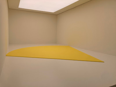
| Ellsworth Kelly, Yellow Curve, 1990 |
To me, the brilliance of these works is magnified when thinking about them in juxtaposition with American art in the 1960s. While the abstract expressionists were expressing emotion and reinstating painterly gesture on the cavas, Kelly was using painting to ask philosophical questions about perception. He was also extending painting beyond the frame in ways unheard of in those postwar years. Kelly made painting architectural, filling space, not only transforming the way that we saw art on walls, but the way that it interacted with its architectural environment. This is superbly exhibited in Yellow Curve, 1990 in which a yellow painting on canvas on wood is placed on the floor of a pure white space, under artifical daylight. Depending on where we stand in relation to Yellow Curve, the walls and the air become bathed in yellow. Although this piece was made in 1990, it's illustrative of how Kelly was changing the parameters of painting, eschewing the rules so to speak, in ways that understandably made his painting difficult to understand.
No comments:
Post a Comment