Tuesday, August 13, 2024

Dominique White, Deadweight @ Whitechapel

Dominique White, The Swelling Enemy, 2024

Dominique White's small exhibition of four sculptures, Deadweight, at the Whitechapel Gallery has received great reviews. It's an innovative series of works that raises provocative questions about the ocean and all that flows with it in this age of awareness around environmental destruction, the legacies of colonialism, industrialization, and forced migration. However, the exhibition is perhaps more conceptually provocative than the works themselves. White spent time in Italy working with craftspeople and historians, effectively researching the history and materials of shipwrecks, flotsam, piracy, and the movement along trade routes over centuries. The historical details are not as apparent as the integration and exploration of specific materials.

Dominique White, Dead Reckoning, 2024

The works engage questions of the detritus of industry and colonialism secreted by the ocean over centuries. Iron rods, chalk, rafia, driftwood are sculpted into emblems of all that has been discarded from the travels of merchant ships, slave ships, and the adventures of industrial modernity. In Dead Reckoning, for example, iron rods tangled together, rusted by time immersed in the Mediterranean, reach into the air like tentacles, as though transformed into a threatening monster-like animal. In another work, rafia and string holding chalky bundles drip from rusted rods. The organic materials look to have been eroding in water over centuries. These works give the impression that everything discarded by human pursuits will grow uncontrollably at the bottom of the ocean. While they may be invisible, apparently wasting away, another eco-system is busy at work. Certainly, decay and simultaneous constant movement and transformation are characteristics of the underground world shown in White's sculptures. 

Dominique White, Ineligible for Death, 2024

In a video accompanying the exhibition, White talks about her time in Italy on a fellowship, visiting various Italian port and inland cities. She talks of the ephemerality of sea journeys, the history of slavery as it is written on the walls of store facilities in Palermo, of the industrial energy of Genoa, the ironworks in Todi, making of bells in Agnone. White's reach for these ancient traditions and activities is fascinating. Certainly, the sculptures show the care and craftsmanship that have fashioned their strange objectness. 

Dominique White, Split Obliteration, 2024
What is less convincing is the connection being made between questions of racial oppression and White's sculptures. Of course, slavery and trafficking, migration and colonization are inextricable from the stories of the ocean. However, it's difficult to see these histories in the sculptures themselves. Otherwise, this small exhibition of four creepy sculptures is well worth a visit. Don't miss out on the video. 

Friday, August 9, 2024

Oscar Murillo and Jannis Kounellis @ Tate Modern

Oscar Murillo, The Flooded Garden, 2024

There is a richness of treasures on exhibition at Tate Modern at the moment, such that it's easy to spend a day wandering and waxing lyrical. I was particularly charmed by the Oscar Murillo installation in the Turbine Hall because it is another exhibition inviting participation. Murillo has hung canvases on makeshift walls inside the Hall, inviting visitors to leave their own expressive marks in a colour palette determined by Murillo. The whole work is supposedly inspired by Monet in his garden, and there is definite resemblance. The colourful, flowing lines in blues, pinks with touches of yellow and green are fresh and vibrant summery images. There are indications of water moving softly in the light and a sense of immersion in light, airy days at Giverny. The line to enter the section of canvas in the process of being painted was long, and I was happy to leave it to children. Because, even more compelling was Murillo's Surge series in an adjacent room. 

Oscar Murillo, The Flooded Garden, 2024

Colourful paintings on paper are attached to plastic white chairs, reminding us of the mutli-functions of art. The plethora of paintings come together in a darkened space to form a community, as though chatting in a square over aperitivo in Murillo's native Columbia. Alternatively, the community of paintings are protesting, reminding us of the placards carried in protests. Around the edges of the space, huge canvases hang as though encircling the protest placards, protecting them from the anti-protesters. The same vibrantly coloured loose brushstrokes cover the canvases, expressing the continual movement of the sea, and those who ride its waves. Still swayed by the inspiration of Claude Monet's late abstractions, Murillo was concerned to explore the darkness and blindness experienced by Monet in his later years. For Murillo, blindness and blurriness is a social condition. The installation itself successfully illustrated blindness, while the works themselves shone their vibrant light throughout the darkened space. The paintings were joyous and light-filled, while the sense of impending danger was carried by the low lighting and the clustering of the placards on chairs, huddling together inside the circle. But that, of course, is just as Monet would have seen it.

Jannis Kounellis, Bells, 1993

Upstairs in the Artist Room, the Greek artist Jannis Kounellis enjoyed rooms of his own. The darkness and threat of his pieces was of a completely different nature from that in Murillo's ocean gardens. But Kounellis's works were among the most compelling on display in the museum. Kounellis is another of those artists who works in steel to make it do things that we don't expect. In the sculptures and installations at Tate Modern, there is something extremely foreboding in his use of steel with other materials that don't go together. Manufactured steel and natural materials such as wood and cotton fabrics are bound together to create impossible and uncomfortable structures. Simultaneously, steel is made beautiful in its interaction with other materials and through display. 

Jannis Kounellis, Untitled, 2005

In one, terrifying work, railway sleepers in the shape of a V, entrap an expressive splash of black paint. The containment of steel speaks to a kind of violence and terror that is everywhere present in Kounellis's work. Knives, meathooks, scissors and other dangers abound in these very powerful sculptures. In one of the most convincing, a rainbow of glass rocks hang like a curtain, framed again by steel girders. The curtain sits next to a rolled steel coal store, spilling with coal. Hanging above the pile of coal is an unlit paraffin lamp. The multi-colored glass rocks are beautiful, the pile of coal and extinguished lamp reminding us of the danger down below. The installation is supposed to have a wall made of a coal behind the curtain of glass, an addition that would threaten the jagged glass rocks. This was not present in the work's display at Tate Modern, but it's easy to imagine how it would give a sense of the pressure weighing on the glass, the threat of mining literally pushing from all sides. With Kounellis, there is always a threat, always a violence just waiting to happen, or having just taken place.  

Jannis Kounellis, Coal Sculpture with Wall of Coloured Glass, 1990-2005


.  
Jannis Kounellis, Coal Sculpture with Wall of Coloured Glass, 1990-2005

All in all, it was a treat to see so many Kounellis sculptures in one place, opening the possibilities of using materials against themselves to show the contradictions and inconsistencies of the twentieth century. Fascinating. 

Thursday, August 8, 2024

Light Installations at Tate Modern

Anthony McCall, Face to Face, 2013

There are some amazing light works currently on display at Tate Modern. I ventured down to the Southbank to see Anthony McCall's Solid Light exhibition and was pleasantly surprised to find other super interesting work in the cavernous ground floor tanks of the Natalie Bell building. 

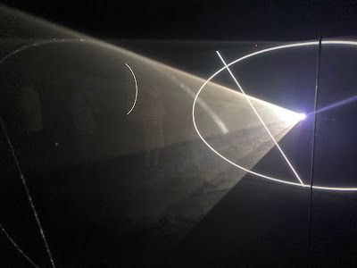
I have long been a fan of Anthony McCall's Light Describing a Cone (1973) as it was one of the first and purest iterations of light as a medium. In the vein of Laszlo Moholy-Nagy, McCall uses cinema to create light installations. Animated line drawings are projected as a circle in the process of closing, or a shape forming over approximately 30 minutes. A haze machine produces an artificial mist, filling the lines created by the throw of the image, making them look like three-dimensional solid objects. Thus a cone, for example, appears as the film progresses. Added to this is the engagement of the museum visitor who is drawn to interrupt the light projections with fingers, hands, heads, manipulating and transforming solid light sculptures into three dimensional abstractions. 

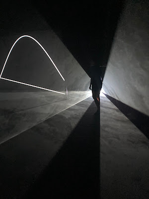
The uniqueness of the works is their invitation to look from different angles. Visitors can watch the line forming a shape on a scrim or screen opposite the projector, in front of them. Or, they can look into the projector lens to see the line forming on the film strip, and equally, interact with the work as a three-dimensional sculpture. Indeed, the interaction of visitors adds a layer of animation that makes the works performative, not simply art works to look at. On the day I visited Tate Modern, children sat in front of the beam to split it, adults held their spectacles in front of the beam to blur the lines of the shape being projected. Still other people huddled under the tent-like mist, looking as if they were protected from the world. Effectively, once visitors engaged, bringing body and light projection together, the works shifted from art works to be looked at to a playground of light to be revelled in. 

I have to admit, while the interactive aspect was fun to experience, the transfer of McCall's work to digital left the artistic magic a little wanting. A glitch in one projection resulted in a very disappointing broken circle. The absence of the whir of the projector and the immediacy of light projected film — surely a significant element in the original installations — made the exhibition somewhat gimmicky.

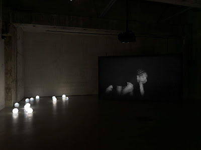
Paul Maheke, Levant, 2018

Downstairs, Paul Maheke's Levant was among a series of rooms housing light installations. Maheke's video shows dancer/choreographer Ligia Lewis dressed in black against a black background, her body barely visible. The text accompanying the video mentioned Maheke's inspiration by theorists such as Edouard Glissant and Audre Lorde. I find the notion of the power of invisibility and disappearance to be compelling. It is a visual language which enables black people to evade capture and commodification because they cannot be seen or located. Together with the electronic music of Nkisi (Melika Ngombe Kolongo), Maheke's video of the spectre-like Lewis dancing produces an image of searching and elusiveness. Apparently Maheke filmed Lewis while wearing a headlight and dancing with her. This process is made visible through a shaky and constantly moving image, creating an effect of uncertainty, anxiety, and slipperiness to the figure. 

Felix Gonzales-Torres, Untitled (March 5th) #2, 1991

Also downstairs in the tanks is a very touching work by Felix Gonzales-Torres. His works are always moving because of the connection they have to his deceased boyfriend who is never represented, but always present. In this untitled piece, the inclusion of the lover's date of death in the title, clearly reminds us of his significance. Twin light bulbs illuminate a vault-like space, gently reminding us of the two coming together as one, and yet, the ongoing possibility that one of the lights might go out at any moment. When this happens, the light cast is halved, showing the loss and incompletion of the one without the other. Inside a darkened, vault-like space, the warm light creates an emotional piece thanks to all of its associations. 

Thursday, August 1, 2024

Shades of Grey @ Skarstedt, London

Gerhard Richter, Untitled, 1970
CR255-1

On a hot London afternoon, it was a pleasure to wander into the deliciously air-conditioned Skarstedt gallery in St James's. For its current exhibition, Shades of Grey, the walls are filled with some equally cool grey works. Once inside and cooled down, I noticed that the selection of paintings, prints, sculptures spanning from black to white in this group show were anything but void of colour, achromatic or cold. There was a lot of life, light and emotion in the diverse selection of works, ostensibly brought together by their "common tonality."

Gerhard Richter, Tourist with Lion, 1975,
CR370
Some of the works in the exhibition were sumptuous, particularly those showing the versatility and surprising complexity of grey. Gerhard Richter's rarely exhibited abstract Untitled from 1970 stood out as one of the strongest works in the exhibition. It is an unusual work in which we see Richter using blooms of grey to explore depth and dimension on a flat canvas. In the smooth flat surface, we see ephemeral paint and our desire to see what is not there: we begin to see airy brushstrokes as wind swept dust, clouds, waves, anything but wisps of grey. The flatness of the canvas shows Richter's interest at this time in his career for the fungibility of painting and photography. Perhaps most intriguing is the work's resonance with paintings such as Tourist with Lion (1975) prompting questions about whether Untitled is an overpainting in which a figure has been erased by grey. Or are the deceptively whimsical movements in grey simply traces of Richter moving around the canvas?

Rudolf Stingel, Untitled, 2012

In another striking work Rudolf Stingel's Untitled, 2012 shows layers of co-existent greys. The pattern of an ancient oriental carpet executed in enamel overlays a variety of greys. The painting from Stingel's Carpet series engages his career-long fascination with the relationship between floor and wall. However, what is most captivating about Stingel's piece is the shifting appearance of the grey paint as it is seen from different angles. Under certain light, from a given angle, the white ornamentation glistens, and from other angles, the billowing dark grey in the centre seems to shift and consume the whole painting. Stingel's painting puts into practice the essence of grey as a constantly transforming — as opposed to dead and negative — colour.

Christopher Wool, Gate (P14), 1986

Christopher Wool does something related, but different when he puts the ornamentation in the foreground rather than creating a dialogue between layers. In Gate (P14). 1986, Wool uses a hard, enamel-like paint on aluminium to create what looks like an industrially made image. The repetition of the motif is perfect, seemingly machine-made. In fact, the motif is applied with a pattern roller. Th result is something similar to a Warhol silkscreen in which inconsistency emerges thanks to the paint wearing off the roller. Up close, we see the very slight differences in the motifs, indicating that each repetition will bring something unanticipated, something hand made to an otherwise predictable pattern. In other places on the aluminium surface, the pattern looks to be touched up by hand, suggesting than the industrially made, commercially produced image is never as uniform as it seems, or as we want it to be. Likewise, the art work is only as original as the hand that fills in the holes and corrects the flaws. 

Albert Oehlen, Titankatze mit Versuchstier, 1999

Like Stingel, Albert Oehlen captures the magic and multivalence of grey. However, for Oehlen, the possibilities of grey are laid bare through applications of paint and a vast palette of different kinds of grey. It's difficult to know what we are looking at when standing in front of Titankatze mit Versuchstier (Titanium Cat with Laboratory Tested Animal), 1999. Up close, swathes of different greys make an abstract painting, and from a distance, the two crazy creatures might be hugging or the one strangling the other.  This is typical Oehlen practicing his trademark confusion in the relationship between figures as well as the conscious thrust of the image. Again, over time spent with the work, we see the dexterity and multiple possibilities of grey, this colour that is supposed to be a non-colour. 

Richard Prince, What's His Face, 1989

Ultimately, I have mixed reactions to Shades of Grey. Of course, it's always exciting to see an exhibition devoted solely to grey. But like other such exhibitions, Shades of Grey lacks an underlying narrative. The group show includes abstract paintings such as those discussed, and then stretches to pieces such as Fischli & Weiss's Small Cupboard, 1987, a handmade furniture piece in black rubber. Like Small Cupboard, a 2020 KAWS sculpture, Gone had very little to do with the colour grey. Richard Prince's scrawls in graphite and ink on white canvas making humorous jokes seemed inconsistent with the exhibition's overall search for the "quiet beauty" of grey.  Lastly, of all Warhol's silkscreens in grey, The Last Supper, 1986 was an odd choice to include in an exhibition devoted to grey, particularly given his abundance of grey works. Overall, thus, it was great to see some of the works in exhibition, but there was not much coherence, particularly, not a "common tonality."