Wednesday, February 24, 2016

Warhol Unlimited @ Musée d'Art Moderne de la Ville de Paris

Andy Warhol, Shadows, 1978-79
Not another Warhol exhibition! I was surprised when the Musée d’Art Moderne de la Ville de Paris announced that its major winter exhibition would be yet another Warhol extravaganza. I assumed I didn’t need to go, as I often do when there is an exhibition of an artist’s work that I have seen over and over again. I left it until its final week to visit. And then, of course, the exhibition was filled with surprises and a million reasons to see more Andy Warhol, yet again.
Andy Warhol, Shadows, 1978-79
The exhibition celebrates the first ever European installation of Shadows (1978-79), and fittingly focuses on a small, but important, selection of Warhol’s series. Shadows, a single work of 102 canvases, the same abstract shadow ricocheting around the curve of the Museum’s main gallery space, each canvas instance in a different colour scheme, reminds the museum (according to the exhibition pamphlet) of individual film frames. The relations between Warhol’s serial screen prints and film strips is no revelation. Indeed, this relationship has often been remarked on. What’s more interesting than the film/painting relationship--and rarely discussed--is the romanticism and painterliness of his work. Shadows presents a particularly outstanding example of this. Of course, it’s not Abstract Expressionist, but neither is Warhol’s painting the factory produced or reproducible object that undiscerning critics make it out to be. Warhol’s reference points may be mass production, commercialism, the press, political and social violence, but the texture of paint on a canvas is as rich and sometimes dense as that of his contemporaries, such as Franz Kline or Clifford Styll. There is always movement and depth on and within the Warhol canvas. I was struck by this texture, thus the variability between canvases in the 102 Shadows. This work has nothing to do with sameness, flatness, predictability or ease of comprehension. It’s abstract and troubling.
Andy Warhol, Screen Tests in exhibition
The exhibition of the Screen Tests here is innovative, but predictably, disappointing. These four minute treasures from 1964 are rarely satisfying when seen in a museum because they were not made to be exhibited in this way. At the Musée d’Art Moderne, multiple screens create an architectural space inside which we stand, always distracted by the screen on our right or left as we try to focus on the one in front of us. I still think the most satisfying display of the Screen Tests is found in my avant-garde and experimental film seminar: one after the other, in a small, intimate blackened out room, in silence. Watching them in this way is revelatory. As we focus on the one image for four minutes the personality of the sitter comes alive: who can forget Anne Buchanan’s tear, Lou Reed and the coke bottle, Mario Banana and the banana? We need to watch them from beginning to end, concentrating, to be with the personality as it emerges across four minutes.

Blow Job, a 35 minute film, shot and shown here on 16mm, is placed in the middle of the Screen Tests, a curatorial decision that completely confuses visitors, I would have thought. The museum insists that the DVD transfers of the Screen Tests must be seen as reproductions, thereby acknowledging the impoverishment of the images we see. And yet, they place Blow Job in the middle of the tests without mentioning its differences. My purist demands aside, it’s great to see some of the tests that have not been published on DVD - Duchamp, Ondine, Bob Dylan, Artaud, Mario Banana. Seeing them in the context of Warhol’s larger project, immediately following a room devoted to self-portraits, I was impressed by the transparency of these works as collaborations. They are portraits based on a close collaboration, even if the collaboration happened by accident. Warhol’s involvement is clearly marked by the use of framing, distance, lighting, and color. And then, given four minutes to behave in front of the camera as they choose to, the subjects are given the responsibility of the performance.
Andy Warhol, Sixteen Jackies, 1964
Walking around, I was also struck by how much of the exhibition is, in so many ways about death, destruction. In turn, both are equated with the press. The Jackie Kennedy series is divine: glamour, death and petition. The unpredictability of the silk screen process: varying, saturation, uneven inking, makes each one different, each Jackie more poignant than the previous one. She, like Marilyn, and curiously connected to Mao and Elvis are slaughtered by the press even as they are celebrated. The Richter connection is obvious: he too made portraits of Jackie, at about the same time. Both artists make portraits that are beautiful, mysterious, and deeply saddened by the fetishization of an icon.
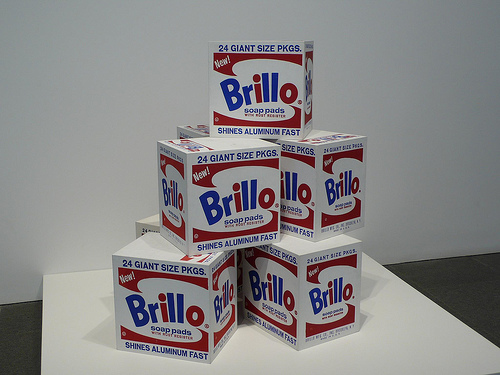
Andy Warhol, Brillo Boxes, 1969
As I say, the exhibition opens with a room of self-portraits. Warhol needed to represent himself repeatedly. It was how he would find out: who am I? The personality of the artist is the title of the Brillo boxes exhibition at the Stable Gallery in New York in 1964. Each one is different, lovingly made. Again, they may refer to mass production, but each is hand made, and each then each box becomes a portrait. After the Brillo boxes, a whole room, in its entirety is a portrait of Mao. Mao represents “The Cult of the Personality” which takes on a whole new meaning after Warhol, because of Warhol, and Mao as he is seen by Warhol. Mao is everywhere and everyone in this room: wall paper, portraits, overpainting, portraits defaced, made beautiful, he smiles, scowls, has a myriad different expressions because of the overpainting, the manipulation, the painterly touches that are anything but mass produced.
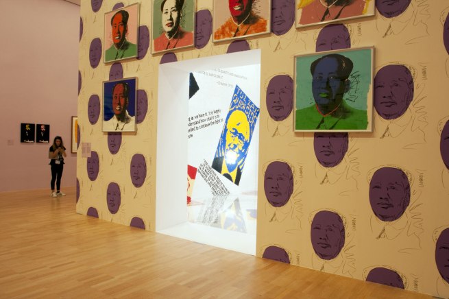
Andy Warhol, Chairman Mao, 1972-73
I came away from the exhibition feeling very nostalgic for the 60s, a time when it was possible to create, to explore ideas and take risks, without today’s urgent imperative to make money from one’s art in order to succeed. I looked on with a kind of longing for the days of The Factory (or La Factory as they call it in French!), for a time when it was still possible to have a place in mid-town Manhattan, where things really happened, and the institutions and commerces in the midst embraced the extreme, the blue skies romantic ideals of young artists. Today, the Warhols and his hangers-on are all priced out of Manhattan, out of risk and experimentation.

Warhol changed the definition and limits of art irrevocably. Indeed, this exhibition makes us aware, it’s because it was the 60s that such radical transformation could happen. I was bemoaning the loss of such inspiration today, and nostalgically yearning for the complications of creative possibility to a friend of my generation. He quickly reminded me that it’s because of Warhol that art is a commercial business today. We live in a world where different demands are made on art, to the point that the immense risk and vast scale of Warhol’s oeuvre could never happen today; it is a phenomenon of the 60s. And in the ultimate irony? It’s because of Warhol that what Warhol did is no longer possible today.


Wednesday, February 17, 2016

Matérialité de l'Invisibilité: L'archéologie des sens

104, Paris 75019
The title of this exhibition, Matérialité de l’Invisible is somewhat misleading. At least, I found it difficult to determine the relevance of invisibility to many of the works. In addition, the premise of the exhibition is not always clear. It brings together artists working in the NEARCH project, a European Commission supported project that explores the relationship between archaeology and heritage in Europe. But again, the works relate to this theme to differing degrees. The coherence of the exhibition aside, there were a number of very interesting pieces which, together with the creative and energetic space of the Cent Quartre Centre, made my rainy Sunday. An interesting piece by Julie Ramage, titled A Beautiful Town, that deals with the self-identity of St Denis, happens to coincide with the November 13 attacks. Another by Ronny Trocker doesn't have much to do either with the theme of invisibility or archaeology, but was compelling. On entering his Estate, we are met by a screen with a still photo of an unidentified migrant who comes ashore in a small dinghy. On the other side of the screen is a series of stop motion photographs superimposed on film of locals enjoying a day on the same beach. The discordance of photographs and films comes to represent the awkwardness of the migrant on European shores, casting a shadow over the heart of European identity and culture. These and some others stood out as quite effective, while others were not so captivating.
 
A Labyrinthe made of cardboard in the basement of 104
Before discussion of the exhibition, I have to say, a visit to the cultural entre 104 in the 19th Arrondissment is  a must. Walking through what was originally a building constructed for the city of Paris’ undertakers, I was plunged into a world of rappers and jugglers, hip hop dancers and acrobats. Old people and young people, children happily running around. The building is built in the style of the industrial buildings of its era (1870s) such as the train stations down the road, and thus a treat to be inside. Daniel Buren’s windows cast coloured shapes on the ground even as the sun barely made it through the clouds on a rainy Paris day. Perhaps the most appealing aspect of the space is that it is accessible to everyone - all ages, ethnicities, cultural and class backgrounds. I was struck by its ability to do away with the hierarchies of traditional gallery and museum spaces.

Some of the works in Matérialité de l’Invisible were conceptually challenging, and yet the same audience from inside the halls spilled over into the exhibition rooms, looking at experimental films, wandering through conceptual installations, all doing their best to grasp the often elusive meanings. I was struck by the power that art has in a cultural centre such as this. As people discussed what they saw, and children of all ages, as well as senior citizens wandered through the rooms, I was impressed that the setting enabled the possibility that experimental, or at least vanguard, art might have an effect on people’s lives.
Agapanthe: Konné & Mulliez, Amas
For people like me who have an aversion to sugar for all of its chemical substance and toxic effects, Agapanthe’s Amas,  sculptures made of sugar were simultaneously repulsive and beautiful. Sugar wraps itself around everyday household objects, consuming them, taking them over, like a monster. But the sparkle and glitter of sugar as it crystallized around empty cans, candy wrappers and non-descript trash was simultaneously, somehow magical as it overwhelmed every object it touched. The contradiction of sugar as it eats into the fabric of daily life was powerfully represented.
 
Anish Kapoor, Ascension, 2008
The piece de resistance of Matérialité de l’Invisible is, unsurprisingly, the inclusion by Anish Kapoor. Ascension is a tornado-like column of smoke falling down from a ceiling fan, becoming vapour as it reaches the ground. Ascension is captivating, not only for its use of smoke becoming an object, but because more than any other piece in the exhibition, it shows the invisible made visible, and then turned back into invisible. This play with vision and materiality is typical Kapoor, as is his wont to make opposites coexist, impossibly. Thus, inside and outside are one and the same, just like the smoke or vapour is both material and immaterial, at the same time. For the children, the puzzling ambiguity of what the column was didn’t matter. They had fun when they played in and with it, deformed it, marveled at it, and immersed themselves inside of it. The children pointed to another ambiguity of Ascension: it is both image and object, even if it is an object always in integration.

Nathalie Joffre, Apparitions
Nathalie Joffre, Data History Voyage


Another artist whose work I found compelling, more for its conceptualization than it’s aesthetic was that of Nathalie Joffre. In Data History Voyage, she uses three pieces in different media to overlay the narrative of the excavation of an archaeological site she was filming with that of the memory of her computer files. Joffre’s was one of the smartest juxtapositions of science and art that simultaneously embraced questions of memory, history, and their narratives to find the gaps and spaces, the black holes of the past, so to speak. In those black holes--the invisible--disappeared the critical information that would enable a comprehensive history and story of what her film, the film in general, attempts to document. This discourse on the narrative of film leads onto the history of the archaeological site in excavation. The multi-media work bridged the past, present and future, as well as the myriad possibilities of visual media.


Sunday, February 7, 2016

Ashes, by Steve McQueen, @ Marian Goodman

See original image
Steve McQueen, Ashes (2014-15)
I don’t know any other filmmaker who moves so comfortably between mainstream and avant-garde film as does the British artist/filmmaker Steve McQueen. And what makes him such a smart filmmaker is that he is convincing in both forms. When watching 12 Years a Slave or Shame we don’t see a Hollywood film made by an experimental filmmaker. Neither, at first glance, do we see any trace of Hollywood in his latest installation at Marian Goodman’s Paris gallery. Although there are familiar McQueen images, most obviously, the serenade between the male body and McQueen’s camera, the image and story construction are distinct.

See original image
Steve McQueen, Ashes, 2014-15
Making the Tomb
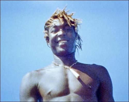
Ashes is two faced: on one side of a screen, a handheld camera shows the beautiful Ashes in a pair of shorts on the front of a boat. He plays around with the camera, knowing how gorgeous he is, how perfect his body is. The camera is lyrical, intimate, and filled with joy as the boat moves across the Carribean Sea. The footage was apparently made during McQueen’s Caribs’ Leap in 2002, but he had never used it. A voice over tells the story of a young man shot in the back on the beach by drug dealers. I assumed it belonged to the projection on the other side of the screen and had nothing to do with the gorgeous young man lolling around on the front of the boat and sometimes falling in the water.

See original image
Steve McQueen, Ashes, 2014-15
Around the back, the image is a complete opposite: two men, lovingly, make a tomb. They caress concrete to make the hard edges perfect in tight, controlled frames. And then we realize, this is the grave of the young man on the front of the boat, on the other side of the screen. And the voiceover fills in the details of what we do not see. How Ashes was killed. The love and care of the spread of concrete on the tomb becomes devastating. It is as if they are enclosing the absence of the glistening young boy’s body, dead, inside.
See original image
Steve McQueen, Remember Me, 2016
Like so much of McQueen’s installation work, the real subject is absent, visually. The murder of Ashes, caught up in the violent world of drugs that is the destiny for young Carribean men is not seen. The story on the soundtrack also marks the absence of images, and the void is somewhere in the incompatibility of the fluidity of a camera that celebrates life on the one side, and the static, contained and tightly framed images of death on the other side of the screen. That the story is absent makes it all the more powerful as we are left to imagine the young boy on the beach, being chased by a gang, as it is told by Ashes’ friends. When we walk upstairs again to the gallery’s garden level, we cannot help but be haunted by Ashes filled with life and joy on the boat. As we are met by the wall of neon repetitions of “Remember Me”, each instance following a unique handwriting, there’s no chance of forgetting what we did not see down below.


Caught in between two sets of images that might not have anything to do with each other if they were not on either side of the same screen, it also occurred to me: isn’t that what narrative filmmaking does? It’s just that the cut is transposed to a physical space that requires we move around the screen to continue the narrative, rather than sitting still in the cinema, anticipating the images that will come to us. Nevertheless, I was impressed by this film installation and inspired by its refusal to represent it’s real subject: the violence and trauma of life of young men in Grenada.


Monday, February 1, 2016

Anselm Kiefer. L'Alchimie du Livre


Anselm Kiefer, Der Verlorene Buchstabe, 2012

Books are everything. In this small exhibition organized to coincide with the retrospective at the Centre Pompidou, Kiefer is given carte blanche to show us his books, and to show us what books mean to him. Books are not always made to be read in Kiefer’s world. Books in this exhibition are notebooks, sketchbooks, the painter’s tomb, objects of contemplation, attached to paintings as celestial revelations, they are objects and images.

Anselm Kiefer, Praxilla, 2004, Sappho, 2008, Erinna, 2006
Kiefer’s books come in all the wrong sizes - they are usually massive, and if they are not, they are often burnt, rusted, decayed or degenerate. They are placed in vitrines, as heads of women, upright, supine, open, closed, with and without tales to tell. Their stories unfold the narratives of German memory, German violence, the Kabbalistic rituals of Germany’s Jews, philosophical discourses on German history. The also function as archives for Kiefer’s thoughts, his dreams and his regrets. They are archived, burnt, rusted, and caked in plaster, dirt, strewn with hair, leaves, watercolours and photographs. Books are made of lead, mercury, sprinkled with salt, gold and silver. They lend their letters to a typewriter before it plummets into disuse, or is put in a vitrine for contemplation by a middle-class audience. None of these books can be read. A least not in the way that we usually think of reading. In fact, we are warned not to touch them, to stay away, their pages opened at a page that we have not decided.
Anselm Kiefer, Nigredo (détail), 1998 – Plomb, acier, fil métallique, huile, sel, plâtre, résine, acrylique et pastel 320 x 160 x 100 cm © Anselm Kiefer – Photo © Ben Westoby – Courtesy White Cube
Anselm Kiefer, Nigredo, 1998. (detail)
Books are at one with nature, they are the supports for catastrophe and purification, and in their most glorious turn, Kiefer;’s books are the fuel and evidence of alchemical transformation. Gold is their equivalent, even or especially when they are made of lead, mercury, salt and sulphur. They are as rarely written in as they are read. But we see inside Kiefer’s mind, his complex thinking through of impossible equations, his guilt, his exploration of a past that he re-enacts because he was not there.

Anselm Kiefer, Das Buch, 2007 (detail)

The books capture all of the concerns that we saw elaborated on in the exhibition at the Centre Pompidou. The pages in the books in this small, but rich exhibition, tell of the artist’s lifelong search to make sense of German history, through legends and memories, the cosmology, the earth, the Kabbalah, poetry and philosophy. Still, for me, the most powerful of the works her exhibited--here as well as at the Pompidou--is that which integrates the book into an immense sea, as a landscape of infinite reach. The book is in lead, of course, Kiefer’s signature material, and it both floats on the sea and is the ultimate prize of the superhuman who can walk across the sea as a landscape. The book is the symbol of knowledge and spiritual elevation, the prize for the lifelong pursuit of understanding, carried across the oceans by the enthral of their waves, never losing its preciousness to their power. Because the book is made of lead, it will sink, probably, before we can get to it. As humans we try for a lifetime to cross the dense, turbulent seas to which the book is attached and on which it floats. I imagine, it is always out of reach, even as it is the inspiration to keep moving.