Wednesday, December 28, 2022

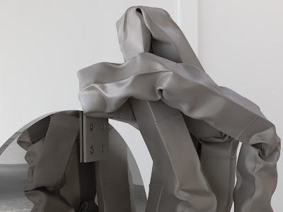
Carol Bove, Vase/Face @ David Zwirner

Carol Bove, Vase/Face, 2022

Steel is one of those materials that surrounds us. Yet, despite or perhaps because of its ubiquity, we tend to ignore it. At best, we dismiss it as dull, sterile, uninspiring. Steel is the fabric and function of industrialized life, and therefore, it bears no more thinking about. Once we have seen John Chamberlain's crumpled steel sculptures, and learnt of the expressive possibility of the material, we probably won't look at steel in the same way again. Chamberlain's steel sculptures fly in the face of everything that steel is meant to do. It is meant to be stalwart and unflinching, cold and repellent. And yet, for Chamberlain, steel creates puzzles, it is an enigma, an idea without weight. 

John Chamberlain, Opera Chocolates, 1994


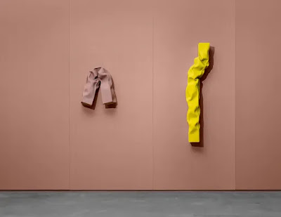
Carol Bove's current exhibition at David Zwirner's Marais gallery does something different again. Something that we would never expect steel to do. Bove makes steel into a warm material, filled with emotion, a sense of play, a material that even has the innate tendency to exude tenderness. In Bove's sculptures, steel is everything it is not meant to be. 

Seeing Carol Bove's new steel sculptures on exhibition around the corner from John Chamberlain's familiar crumpled cars at Karsten Greve makes Bove's work even more peaceful, delicate, and emotionally charged. The cynic might want to say that Bove couldn't possibly do anything new with steel, that Chamberlain took steel to its ultimate beyond. But Bove's work is different, made in a different moment, speaking to a different world. Unlike Chamberlain's, Bove's sculptures are not in conversation with abstract expressionism and the fraught energy of brushstrokes by the likes of De Koonig and Kline. Her curious lengths of manipulated tubular, painted steel might be in conversation with painting. The pink, yellow and orange pieces, bent, turned, folded and scrunched together might be hung on walls, but unlike Chamberlain's, Bove's sculptures do not use the language of painting. Rather, they remind us of animated stick figures and squiggles, always about to jump off the walls and change their shape. If Chamberlain's meticulously worked, spray painted piles of steel make sense in an era when images were influenced by a need to move away from representation, Bove's connect to an era in which images are technologically determined.


Carol Bove, Vase/Face, 2022
David Zwirner

Again in a refusal of the deterministic nature of the image today, Bove makes works that are intensely physical and material. They are strikingly sensuous - not something that can easily be said about steel. The smooth matte paint, evenly applied, bears no trace of gesture or the artist's thoughtful application (unlike the rainbow of colours sprayed and painted over Chamberlain's). But the surface is given the appearance of velvet. It is all we can do to stop ourselves from reaching out to touch them. 

Carol Bove, Vase/Face, 2022
David Zwirner

In Zwirner's main gallery, the sandblasted steel tubes are contorted and crumpled, folded over huge glass disks, as though hugging or stroking the human-sized circular shapes. The grey walls, floor and wrought iron glass ceiling create an environment in which everything is possible. The challenge to the materials of both glass and steel through creating relationships between them that are more like friends in a grey space, turn sculptures into living, breathing beings that shift and change as we walk around the gallery space, seeing them from different perspectives. There is no doubt after visiting this exhibition, that neither grey, nor steel, can be said to be the unyielding and uninteresting phenomena that the world claims them to be. 

Carol Bove, Vase/Face, 2022
David Zwirner

If Chamberlain creates a physical experience inviting us to navigate the twists and turns of newly manipulated metal scavanged from scrap heaps and abandoned cars, commenting on capitalism, car culture, the hard edged industrial world that has gone awry, Bove's is a world in which our eyes and our emotions come into conversation. Her works don't so much shape space as Chamberlain's do. But they do push our senses to limits that they have not otherwise been challenged to go. 

Sunday, September 4, 2022

Charles Ray @ Centre Pompidou

Charles Ray, Self-Portrait, 1990

Ray entertains the similarities and differences between mannequins and sculpture. His sculptures are mannequins, but they take poses that are one step removed from familiar classical sculptures. For example, a boy crouched down to pick something from the ball of his foot reminds us of the Hellenistic sculpture of a boy removing a thorn from the same. Boy with Frog 2009 stands in the pose of a classical sculpture, even though it is clearly a contemporary image of a typical boy with his catch. However, unlike its function in centuries past, for Ray, sculpture is a form of advertising, and a clothes horse for naked bodies. But it is also about the mannequin as a double, the mannequin as art work, as a performance of the social, cultural sexual relations that we actually live. 

Charles Ray, Fall '91, 1992

All of Ray's figures are the wrong size. That is, they are over or undersized, asking us to look up to or down on the figures. Thus, our relationship to his sculptures is quite different from what we expect. In a work such as Fall '91, an oversized mannequin changes her size, depending on where we stand as we look. From afar, she looks like a mannequin of human size, but up close, she is a giant. Unless, of course, we see someone standing next to her when we are at a distance, then we know how big she really is. This is deception of size has been a characteristic of sculpture for centuries. Michelangelo's David was made for a pedestal in a public square, therefore, from below. Accordingly, his figure is distorted so that when we look up at him, the figure is perfectly human-sized and proportioned. 

Charles Ray, Portrait of the Artist's Mother, 2021

Much of the work seems to be about generations, about the relations between children and parents. The sculpture of his mother in the pose with a slight twist on that of Manet's Olympia is sees an oversized woman masturbating. Mothers are clearly a big influence on Ray. It's difficult not to see the large and the small figures as playing on the power relations in families.  When the children are the same size as the parents, surely Ray is not creating bridges between generations, but giving a very immediate sense of how one generation is threatening and overwhelming another. Alternatively, we may see the sculptures of things and people as proportioned according to the size that they take up in our minds. 

Charles Ray, Family Romance, 1993

Ray also has a fascination for fabrics. But like the sizes of his sculptures, the material in which they are made is always off. The small person bending down to tie his shoe lace (reminding us of the boy taking the splinter out of his foot) is fabricated in stainless steel. The sensuousness of classical sculptures in marble and bronze are transferred to the industrially produced steel. Similarly, there is always an emphasis on the plasticity and construction of the body as a performative vessel - even when it is in a photograph of Ray himself. Even when he uses real hair, the figure looks plastic, or fabricated. This, of course, makes them completely different from the realist figures of a sculptor such as Ron Muecke - in fact, Ray's are the exact opposite. The figures are clearly representations, without empathy, without any hold on the viewer's emotions. Again, even in the self-portrait photographs, Ray looks like a mannequin of himself,. 
Charles Ray, No, 1992


Boilly: Chroniques Parisiennes @ Musée Cognacq-Jay

https://www.connaissancedesarts.com/wp-content/thumbnails/uploads/2022/02/cda22_diapo_boilly__0004_calque-2-tt-width-1200-height-675-fill-1-crop-0-bgcolor-333333.jpg
Etude avec cinq autoportraits de l'artiste, vers 1823-1827

Louis-Léopold Boilly was a revolutionary artist, in all senses of the word. His oeuvre sits between two revolutions—those of 1789 and 1848—and so it's not surprising that he often depicts the people of the streets. Unlike painters and portraitists of his and previous generations in France, Boilly had a suspicious view of the bourgeoisie, the police, the army. His real subject matter was everyday life. Moreover, it was everyday life on the streets of the city. 

Most exciting about Boilly's painting was his thirst for new technologies and what they could bring to painting. I knew enough about his work from the pieces in the Louvre to know that he was pushing at the boundaries between painting and theatre, but what is revealed in full scale over and over again in this current exhibition at the Musée Cognacq-Jay is the way that Boilly looked forward to the cinematic image.

Fichier:Louis Léopold Boilly - La prison des Madelonnettes, rue des  Fontaines - P1310 - Musée Carnavalet (cropped).jpg — Wikipédia
La prison des Madelonnettes, rue des Fontaines, 1815-1819

In painting after painting, Boilly plays with what will become the defining characterstic of the cinema two hundred years later. His figures look from different perspectives, in motion, in scenes that give the illusion of motion. In Le prison des Madelonnettes, rue des Fontaines, for example, he juxtaposes light and shadow in the two halves of the painting and each is filled with people and their pursuit of morally good and bad activities respectively. Looking at this work, we also get a sense of a developing narrative unfolding across the width of a painting, statues being brought to life, in two halves that are like scenes whose relationship is only established in the image itself. 

Jean qui rit et Jean qui pleure, vers 1808-1810

Visitors to the exhibition will also notice that Boilly was fascinated with illusion, with effect, with expression as a way to attract a response. There are doublings and mirrorings everywhere in his work. His figures have exquisitely painted faces filled with emotions and expressions, the fabrics of their clothes are so textured that we want to touch them. But the bodies are often distorted, misshapen, slightly out of proportion. It is as if they are being seen through a distorting lens. And then in the final room of the exhibition, there is the object that the whole thing has been moving towards: a camera obscura and a selection of early optical toys—a zograscope, telescope, a pantographe. These are the instruments Boilly used to see the world differently, through new optics, that he then translated into painting. It's easy to imagine that had Boilly lived one hundred years later, he might have turned to the cinema for his artistic expression.

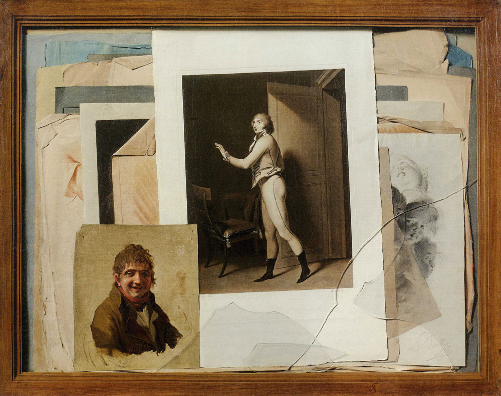
Louis-Léopold Boilly - Trompe l'oeil of a Collection of Drawings, with  Portraits of Boilly and
Un Trompe l'oeil, detail, vers 1800

Perhaps the reason that Boilly is not as well known today is his diversity and range. He moved from portraits to genre paintings, to city scapes, trompe l'oeil, caricatures and still life. Boilly never sat still long enough to develop a reputation for anything. Similarly, he painted the kinds of people that the salons had no interest in: prostitutes, criminals, poor artists such as himself, those mixed up in the hustle and bustle of the train station. In this, his voracious appetite for experimentation and innovation made him so far ahead of his time that no one would have known what to do with him. 

Humour, trompe-l'œil, libertinage... Cinq raisons de découvrir la peinture  de Boilly au XVIIIe siècle, au musée Cognacq-Jay - Panomou
La Marche Incroyable, vers 1797

Ultimately, this lovely exhibition shows Boilly to be a man of his age, but as such, he is a man ahead of his time. Boilly was inspired by streets taken over by masses of people, by train stations and street dwellers. And he was interested in depicting his modern world through the instruments of his time. He blurred the boundaries between mediums where painting and photography (hence the grey of his works) and sculpture are brought to life. His depictions of theatre in the streets, together with multi-perspectival pictures that preface the cinema made him a man reaching for modernity on the streets of Paris, even before it had fully arrived. 

Thursday, August 4, 2022

Jean Painlevé, Les Pieds dans L'eau @ Jeu de Paume


Jean Painlevé

I loved the Jean Painlevé exhibition at the Jeu de Paume, if only for its offer of the opportunity to see these strange films on the big screen. There are a number of short films, many of which will be unique and revelatory to viewers. True to their intentions, the films are educative on many levels. We learn about male sea horses giving birth, watch octopuses mate, examine various oils under microscopes (mainly kaleidoscopic drops exploding like fireworks), and marvel at the effect of light on sea urchins. Some of the documents of flowers and other natural phenomena, accelerated to show slow evolution and natural processes in minutes of film were also fascinating for their resonance with early experimental film and new objectivity photography.

Jean Painlevé, Étoile de mer, vers 1930


Also wonderful was the exploration of the cinema in these films. Painlevé was concerned to educate and convey information, but he was just as focussed on exploring the possibilities of the cinema which, in his time, had not yet been fully revealed. In images that in which sea creatures merge into their environment or flowers /plants bloom, and asteroids move around the sky, Painlevé uses natural events to explore the possibilities of the camera. The beauty of his manipulation of light and dark, the framing, the keen awareness of the cinema's ability to manipulate time and space were all quite breathtaking. Painlevé may have been trained as a scientist, but he also had a keen sense of the way that images work. 

Jean Painlevé, Buste d'hippocampe, vers 1931

More disappointing, however, was the exhibition's contextualization of Painlevé's experiments. The films are presented as objective documentary records of Painlevé's scientific experiments and research. Thus, there is little to no mention of the staging of the films. Because of the way that Painlevé filmed, namely, removing the manipulation of the pro-filmic, we watch sea horses in their life cycles as if Painlevé was underwater with them. The removal of the marine life from their natural habitat, their placement in tanks, the staging and manipulation of the animals, clearly compromised, or at least, contributed to the definition of the kind of documentary film that he was making. This isn't to detract from the splendour of his images, or the amount that we learn from watching the films. Rather, it speaks more my disappointment that there was not enough information on what these films were actually doing.

Jean Painlevé, Détail de la pâle d'une queue de crevette, 19229

Another, related, thing that is not acknowledged by the exhibition is the historical moment of the cinema in which he was making these films. Painlevé was filming at a time when the lines between fiction and documentary, between experimental and documentary were not yet fully drawn or defined. Theorists were still trying to come to terms with what the cinema was about in this moment, and Painlevé was one of the experimenters asking these questions. Thus, his contribution to the very important debates about the cinema is elided in this otherwise fascinating exhibition

Saturday, July 2, 2022

Tatiana Trouvé, Le grand atlas de la désorientation @ Centre Pompidou

Tatiana Trouvé, The Guardian, 2022

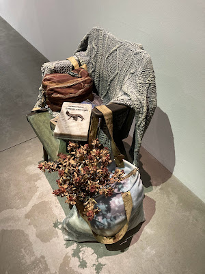
I am such a fan of Tatiana Trouvé's The Guardian sculptures that I would travel around the world to see one of these quietly, contemplative chairs resting in a corner of an exhibition. The handful included in the current Pompidou exhibition are gorgeous. It is all I can do to stop myself sitting down, sinking into a wicker seat to rest my weary legs. As I stand there, I want to rifle through the open bag on the chair, throw the cardigan around my shoulders and read the interesting books. That is, having cleaned away the cigarette box used as an ashtray to make way for myself on the seat. 

Tatiana Trouvé, The Guardian, 2022

In the Pompidou exhibition, as always, The Guardian examples sit quietly, unassumingly, at the edges of the room, to the side of the other works. I waited and watched other visitors, only to see them ignore the seats filled with someone's belongings. They chairs are so understated and discrete, to the point where they don't ask to be looked at like art works. And yet, they are art works. They are intricately crafted from bronze, marble, onyx, brass and sodalite. The sculptures are fascinating and inviting when we recognize the work that has gone into making hard, inflexible materials into lusciously soft fabrics and objects. 

Tatiana Trouvé, The Guardian, 2022

The sculptures are also compelling because they are simultaneously life like and not. Their placement against the wall, aside from the other works makes them appear to me as if they belong to the attendant who has just slipped out for a moment. There is always a book, a bag, a personal item, usually cast in sensuous marble, sitting on the seat. They show more than the traces of human presence, tell of beings more real than ghosts of the past. These are the chairs of people who have just popped out, with all the signs of "I'll be back" left on the seat. They speak of an immanent presence. They are also about the people and things that are invisible: the sculptures themselves are invisible to some visitors, as if they are or were occupied by an invisible guard, those tireless museum workers whose presence allows us to be in the company of fragile art works.

This exhibition also includes a wall of Trouvé's lockdown drawings that she made on the covers of the world's leading newspapers. Trouvé draws her bed, her dog, her wardrobe, her everyday life in her studio over the top of the dramatic headlines that accompanied us through the months from March to May (2020). The superimposition of the everyday over the devastating news of death and disease, the recounting of numbers and alarming headlines often acting as warnings, makes obvious sense. This is how we all lived in lockdown; our ordinary lives and a world in crisis outside our doors overlaid each other for months on end. As I browsed the warnings of war, death knells and governments on their knees, I was astounded at how far away it all seemed. When I think about how consumed we all were by statistics, masks, government restrictions, and vaccines, and yet, today, most days, it doesn't even cross my mind that we are not even one year out of a global pandemic. 

Saturday, April 30, 2022

The Delight of Contemporary Art @ Pinault Collection, Bourse de Commerce

Maurizio Cattelan, Others, 2011

I took my friend Harriet to see the new exhibitions at the Bourse de Commerce last night. As we walked along the outside of Tadao Ando's concrete cylinder, laughing at some of Bertrand Lavier's objects in the display cases that have been there since the building's days as the Bourse, marvelled at the fresco depicting trade in the colonies, and the magnificent reflections of the early evening sun shining through the latticed roof of the dome, I thought that this magnificent building should be the mandatory first stop on every tourist visit of Paris. Visiting the Pinault collection is pure pleasure. It is, perhaps, the most comfortable and welcoming modern art museum in a major city. It's difficult to describe how delightful it is to wander the exhibitions and the building itself.

Charles Ray, Boy With Frog, 2009

We stopped in front of a Lavier piece of two crystal vases accompanied by the text "only one of these vases is real" to have a long discussion with two other visitors about which they thought was real. Being the know all, I was convinced as soon as I saw the display that the two vases were identical, and Lavier had simply included the text to keep us guessing. As Harriet pointed out, if only one was real, what kind of real would that be? In fact, whether or not the vases were real or fake was not the attraction of the display, but rather, the point of the piece was its play with our heads and temptation into animated conversation with strangers. This level of visitor engagement is maintained throughout the exhibitions on the first and second floors. 


Ryan Gander, With /.../.../..., 2019

I remember a friend bemoaning that she didn't really understand the Urs Fischer statue in the collection's opening exhibition. However, I am pretty sure that a lot of the art on display at the Pinault is not that difficult to "get".  Ryan Gander's stuttering Animatronic Mouse who has gnawed its way through the gift shop wall, or Marizio Cattelan's pigeons looking down from the third floor railing are exactly what they appear to be. The mouse and the pigeons are intruders into the precious world of art, making fun of its seriousness, showing us all that laughter and wonder are valid responses to art. 

Roni Horn, Dead Owl, 1997

The two temporary exhibitions also encouraged a frolick with art, eliciting physical and emotional responses. Roni Horn and Felix Gonzalez-Torres' exhibition on the ground floor created a lovely dialogue between the two artists. My absolute favorite piece was Horn's Dead Owl, 1997. The two fluffy white owls are both adorable and creepy. Their soft silken feathers make them like dolls sitting on their perches. But the title reminds us, they are dead, stuffed animals. The owl was photographed in Iceland, a country for which Horn has an ongoing fascination. But as an American, I am sure, Horn is aware of their symbolism within Native American culture as harbingers of death. Making the owls even more cuddly and curious, but simultaneously, unnerving is the fact that when standing in front of them, our eyes never rest. We constantly flit between one photograph and the other, comparing them, looking for differences, as if expecting them to reveal the answer to a puzzle. Of course, walking from side to side, the eyes of both owls never leave us, following our every move. Being watched by art works is always the most unsettling experience in a museum.

Charles Ray, Oh! Charley, Charley, Charley, 1992

There is a large Charles Ray exhibition in the level two galleries, complementing the Centre Pompidou's spring exhibition. Ray also has three pieces under the dome in the main circular gallery: a child, himself and an old, reconstructed truck. Ray's works are also unnerving, but unlike my experience of the Pompidou exhibition, my resounding response to the pieces on display at the Pinault was his obsession with naked male bodies, especially his own and those of young boys. It's true that a lot of his works re-conceive religious and classical sculpture, they also play with the traditional display of sculpture. In addition, Ray manipulates spaces and size and makes our movement through the gallery visible through the changing size of the sculpted figures when seen from different perspectives. But these works are not only working on an intellectual level. Ray has an obsession with pubescent male bodies and sexual fantasies, and you don't need an art history degree to get that!

Friday, April 29, 2022

Richard Serra, Transmitter @ Gagosian Le Bourget

Richard Serra, Transmitter, 2020

Last weekend, I ventured out to Le Bourget with my friend Sylvie for an initiation into Gagosian's space in a former airplane hangar. It's quite a trip out to the northern suburbs of Paris by train, and then bike for a few kilometres to the small airport. On arrival, it was a different world, until of course, we stepped inside Gagosian's space. It was like being back in the centre of Paris, surrounded by familiar white walls, skylit space and hip, surly gallery staff. I had anticipated a much bigger space, and surprised to see that the gallery was not so much bigger than Gagosian's London galleries.

Gagosian @ Le Bourget
Serra's sculpture itself was magnificent, of course. The dizzying, nausea-inducing lean of the Corten steel was intense, and the journey of discovery through corridors, opening out onto two circular enclaves where the visitor was invited to rest and relax, only to be pushed out through the sense of instability was unsettling. We wanted to stay, but on discovery that there was nowhere to sit because of the awkward lean of the steel, we were left with no choice but to keep moving. The narrower the corridor, the faster we moved.


As the only visitors to the gallery, Sylvie and I had fun with the echoes and reverberations of sound that must have been Serra's intention, though it's difficult to know if he sculpted the steel knowing the visitor would create echoes and voice modulations. But surely, a work titled Transmitter is designed to create a sound scape? The sonic element made the piece a departure from other Serra sculptures I have experienced: the steel curves, ribbons, caves and canyons becoming a device for transmitting data through sound waves lift sculpture to a whole new level. I could almost feel the sensations of being in a chasm, then a gorge, then in a clearing in the wild, alone, isolated within the space. 


The echos were long and resonant, changing tone, volume, and density as we moved through different spaces, again, dependent on the curve of the steel, the width of the corridor, the lean of the steel opposite where we were standing. As is always the case inside Serra's sculptures, I felt my body transformed, my senses brought alive. It was an incredible experience. Sadly, the wonder of discovery mixed with the disorientation that comes with physical movement in a Serra sculpture was cut short. As we were having fun with our voices, feeling the reverberations as though we were lost in the outback, the young man from the gallery's front desk came running to find us. Apparently, it wasn't permitted to make such noises in the gallery. The irony was not lost on us: as we were engaging with a work titled Transmitter in an airplane hangar stretching the length of a city block, the only visitors in the gallery, that we were asked to lower our voices. I would have thought that our physical responses to the works was exactly the point of it?

And so, not to be defeated by what seemed like the illogical orders of the gallery, Sylvie and I moved up close to experience the weathered, changing surface with other of or senses.
I ran my fingers across the rough metal until they reached its seams, and when I removed my hands, they were orange. We stood back and watched the light streaming in through the roof as it changed the colour of the sculpture from orange to brown, to tan, to a deep dark black when seen from certain angles. Ultimately, the physical relationship struck up between Serra's sculpture and the visitor is magnetic. When our bodies move around, through, up close and away from Transmitter, our senses are so enlivened that, like filings to a magnet, nothing can break the pull and the revelation of being in its presence.  

Saturday, April 16, 2022

James Abbott McNeill Whistler, Arrangement in Grey and Black no. 1, 1871

This single room exhibition of Whistler's works from the Frick, together with the masterpieces owned by the Musée d'Orsay is breathtaking and surprising. The small, but rich exhibition includes three pastels and twelve prints of Venice. The three pastels are among the most exquisite works in the Frick collection. With what seems to be a single sweep of sky-blue pastel across brown woven paper, Whistler captures the light flickering on the waterways, apparently seen from his gondola's approach to the island of the San Michele Cemetery. Most magnificent of all is the austerity and darkness hanging around the island, a mood captured in a few rubs of black pastel. In an more sketchy pastel, the quiet and lazy afternoon along a back canal is brought to life in Venetian Canal, with atmospheric window shutters, gondolas rocking on shadowy water created through more rubbing of pastels. From these Venetian drawings, I have the feeling that Whistler was as interested in time as it is measured by the sun, as he was in the surface of water, buildings, boats.

James Abbott McNeil Whistler, The Cemetery: Venice, 1879

Equally as insightful and filled with the secrets of Whistler's preoccupations in the late nineteenth-century—the same reasons for which he was so criticized by the Paris Salon—were the ocean paintings. Included here is Symphony in Grey and Green: The Ocean (1866)

James Abbott McNeil Whistler, Venetian Canal, 1880

In this painting from Whistler's time in Chile, we see him dragging his brush horizontally across the canvas to create movement and light on a calm sea. The visibility of the brush strokes produce wispy clouds and sea waves, much to the outrage of the keepers of acceptability in art in the nineteenth century. Most striking of all is the flatness of the painting with sky and sea distinct, yet without depth. The only indication of perspective comes from the branches in the foreground which were apparently painted in at a later date. With this flatness comes a timelessness. Therefore, while the canvas may show the sea at a particular moment in the day, it is also placeless and ahistorical. 

James Abbott McNeill Whistler, Symphony in Grey and Green: The Ocean, 1866

The same can be said of the Musée d'Orsay's Variations in Violet and Green, 1871. The stamp on the right hand side reminds us of Whistler's debt to the Impressionists' and theirs to Japonisme. Indeed, we can see the compositional dynamics of Hokusai and Hiroshige in Whistler's otherwise natural world. The composition on the vertical, the separation of spaces making the painting appear without perspective, enabling it to engage multiple narratives. Taking pride of place in the exhibition is Whistler's portrait of his mother. For all of the beauty and risk of the sea paintings, the insight into what was most important to Whistler in the Venice pastels, the Arrangement in Grey and Black no. 1 is still the masterpiece in Whistler's oeuvre. At least, it is the most exciting piece on display in this exhibition. The three portrait paintings as symphonies in colour from the Frick collection, said to be in the tradition of Velazquez and Gainsborough, are impressive for their balance between naturalism and modernism. But Whistler's portrait of his mother is the most exciting work, if only for its audacity in breaking all the laws of painting from the period. 


Sunday, March 27, 2022

Ed Clark, Without a Doubt, Hauser & Wirth, London

Ed Clark, Untitled (Paris), 1998


Before going to see the Ed Clark exhibition at Hauser & Wirth's Saville Row space, I was convinced I would find something familiar. Even though I didn't know Clark's work, I thought "how different can it be?" New York School emerging in the 1950s, working in the 1970s and 1980s, pushing painting. beyond abstraction ... it all sounded like something I knew well. 

Ed Clark, Without a Doubt
Installation View, Hauser & Wirth

However, the work turned out to be different from what I was expecting.The surprise in the painting comes in the frequently hard lines of the stroke and the rainbow of colours inside those lines. The colours and composition were familiar —blues, pinks, some spectacular reds moving across the horizontal line of the canvas. In some paintings the movement was on the vertical, or in curvature, always stopping short of connection with other colours and other movements.The innovation of the movement's direction was curious and gave pause for reflection. But what makes Clark's brushstroke special is its application. 

Ed Clark, Untitled, 1996

Clark pours multi-coloured paint and then uses a household broom to sweep swathes of thick oil paint across, up and down and around the canvas What the art world knows as Clark's "big sweep" results in wide multi-coloured strokes in which purples, greens, yellows, greys appear out of opposite and unrelated colours to surprise us. Though, at first sighting, it seems as though the unexpected colours emerge from the crevices of the main colour, when we realize that Clark has swept the paints with a broom, the painting starts to makes sense. This is how he has produced the distinct line that cuts through many of the images.

Ed Clark, Paris Gothic, 1993

As I walked around Hauser and Wirth's gallery, I couldn't help thinking of Mondrian's sea compositions. While Mondrian's canvases were muted and limited in palette, the shape and composition seems like the obvious precursor to Clark's. The oval composed on the vertical, that strange, in between shape that is neither circle nor oblong is the shape that Mondrian used a century ago to challenge the conventions of composition. As early as 1911, he painted within an oval matte, and then by 1914, the edges of the oval themselves had become blurred. Clark similarly pushes at the limits and boundaries of the expectations of painting. He becomes one of the first artists to paint on shaped canvases. Assuming that Clark had his supports custom made, I was reminded also of his distance from the gestural marks of painting so beloved by his fellow Abstract Expressionists.  

Ed Clark, Untitled, 1976

Brooms and buckets, together with custom made frames should produce an aesthetic of coldness and remove. Yet, they are warm and sensuous, reminding us of sun rises and sunsets over the ocean. Thus, what makes the paintings unexpected and unique is that the application of paint, and the sometimes aggressive changes he makes to the canvas add up to something quite different again: these paintings are nuanced and lush, reminding of nature, where their technique would logically suggest the very opposite. 

Friday, March 4, 2022

Lubaina Himid @ Tate Modern

Lubaina Himid, Between the Two My Heart is Balanced, 1991

It was a real treat to see this superb exhibition of Lubaina Humid's work on my first visit back at Tate Modern since BC. It was also my first visit to the new wing, and happily, I didn't need to spend much time in the access spaces. While I understand their architectural innovation, they were too far on the dark brick and concrete side to make them anything more than transitional.

Lubaina Himid, Le Rodeur, The Exchange, 2016

The critics have not been kind to Himid or Tate Modern for the exhibition's apparent acquiescence to the institutional demands of art, but I couldn't help thinking these detractors had missed the point of the work. This is not angry, volatile art designed to stir up a revolution. Of course, this lack of attention to racial and colonial politics is what disappoints the gatekeepers of who says what in art today. Himid's are paintings in which people have conversations, in which the interactions between multiple figures are more important than the public impact of their conversations. The paintings are peopled with black people discussing, rather than black and white people arguing or raising fists. Indeed, the absence of white people from the paintings in direct contrast to the near-absence of black people from the exhibition could hardly be missed. Although Himid's work is easier to access, more narrative and efflorescent, I kept sensing that these paintings would juxtapose for their contrast to those of Marlene Dumas or Kerry James Marshall. In Himid's work, there is none of the pain and sorrow of the South African painters. 

Lubaina Himid, Ball on Shipboard, 2018

The exhibition is, like much of Himid's body of work, in many ways, about space. it is about the spaces we occupy, the things with which we fill spaces. The creation and building of space, the conventions and colours of construction, and how we are living in spaces that are given us, rather than spaces we create. The paintings are about how often those spaces don't suit us, don't work for us. Moreover how we are constantly trying to fit into these spaces nevertheless, to change ourselves to fit. Similarly, Himid's painted spaces are about colour. The colours are magnificent, they are very much those of Africa, used to distinguish unfinished spaces, infinite spaces, as well as those that are limiting and falling in on us. The spaces are typically the spaces in which we (especially women) live, but they are also spaces opening up onto public and political life. In The Operating Table, for example, three women discuss a map, the ownership and use of land.

Lubaina Himid, The Operating Table, 2019

One room of the exhibition is given over to blue and the language we use to describe, evoke and recall blue. In a connection to the discourse on space, Himid's reflections on colour are about how blue creates perspective (how we see it/ how we describe it/how we occupy it) depending on our culture and language. The installation shines a light on what we are told of space, what we learn through reading, culture, tradition, and of course, advertising. And then, in the blue room, questions of memory and history are everywhere as they are sequestered in blue furniture, blue objects, fabric from the past. 

Lubaina Himid, Three Architects, 2019

I found the exhibition to be delightful. The brilliant colours are enchanting and uplifting, themselves creating complexity within the image. One of the things that I loved about the groups of people in each painting was that they were never in power struggles and neither were they buying into gender stereotypes. Women discuss what it would be to have had women discover the world, build houses and lead countries. Men meet each other in bars and turn up at the bottom of drawers. Somehow Himid manages to communicate the result of the power and manipulation that is now invisible. Just as it is in the world that we live in.

Lubaina Himid, Tide Change, 1998

In many of Himid's paintings, the sea is the central element. Even when the image depicts people in conversation, at parties, and at work, they are often surrounded by the sea. For Himid, in the presence of the sea, her paintings reveal what is a pivotal concept in her art. The exhibition reveals double-entendres, inviting the visitor to see differently, see things from multiple different perspectives. And we see the ocean from every angle. We see it through windows, as a backdrop to conversations, surrounding a lookout, and even in abstract composition. 

Himid's work may be "old school" as one reviewer for The Guardian put it, or as others have insisted, lacking the cutting edge so key to a growing recognition of racial and cultural identity. But that makes me a fan of the old school. As narratives these paintings take time to digest, to read, to incorporate into our understanding of the way things are. I would rather look at art that makes me think, than art that gives predictable answers to complex contemporary concerns.