Wednesday, July 30, 2014

Unedited History: Iran 1960-2014


MAM, iran, exposition, musée, ARC, art

In Paris I am always curious to know what criteria have been satisfied to earn an exhibition at one of the state museums. Why would the French be interested in the censored and banned images from modern Iran? The mystery is solved very shortly after entering Unedited History, as we learn that so many Iranian artists from the post-1979 Revolution period came to France, and have indeed made their name here. At least, a large number of those exhibited are now living and working in France.
Kaveh Golestan
Kaveh Golestan, Prostitute Series, 1975-1977
Documentation accompanying exhibition
Unedited History starts tentatively with the paintings and other arts of the pre-Revolutionary Shah’s Iran. I say tentatively because the works were preoccupied with aesthetic issues, experimenting with form and style in a search that brought together traditional and Western art forms. And then the revolution happened. By the late-1970s, all the experimentation of the previous two decades was left by the wayside, overwhelmed by an urgent and unprecedented passion for change and the possibility of freedom in life and art. Among the treasures on exhibition in Unedited History was footage shot by Kamran Shirdel of the 1979 revolution as it took place around him. Entitled here Memories of Destruction: Rushes from the Revolution, we see, minute by minute, the slow unfolding of events that changed the world. Two things struck me about this rare footage: first, much of what we see is a dense crowd, walking. Motion and protesting in Iran 1979 belong together. I don’t know what to make of it, but I think of, for example, the Egyptian Revolution, and I think of Tahrir Square packed to the rafters with protesters sitting, standing, protesting. And I wondered why the walking in Iran? Was this related to the relative invisibility of the Ayatollah in the leadup to the overthrow of the Shah? That is, with no leader to look at physically, the people were left to walk in search of freedom? Second, I was struck by the separation of men and women in the footage. Of course, they were separated, even in revolution, but nevertheless, it’s a surprise to see the adherence to religion in the midst of revolution. Even when this revolution is in the name of Islamic Law. In confirmation of what I suspected was Shirdel’s extremely rare footage, a google search turned up no reference to the film. Just to see this footage is reason enough to go visit this exhibition.
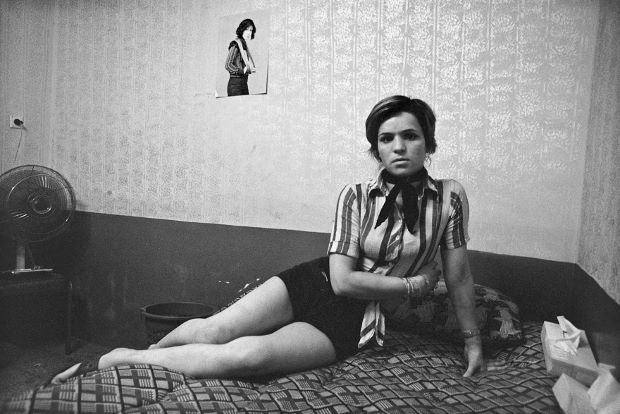
Kaveh Golestan, Citadel, 1975-1977
Also really powerful were Kaveh Golestan’s photographs taken in the redlight district of Shahr-e No, otherwise known as the Citadel, in Tehran, 1975-77. The area was erased in the 1979 revolution, and again, I found myself amazed at the awkwardness of gender relations. It wasn’t just the presence of prostitutes in the Muslim-Arab world, but the presence of the male photographer inside that world that left me amazed by the images. And it was a sparse, sad, cold world. Often with a single image on the wall, a threadbare cover on the bed or its equivalent, years of grime on the walls, there’s nothing glorified about sex in these photographs.
2
Tahmineh Monzavi, Ateliers de Confection de Robes de Mariée
Quartier de Mokhberodeleh, Teheran
, 2007-2011
 Later, towards the end of the exhibition, face to face with Tahmineh Monzavi’s photographs of underground fashion designers, in contemporary Tehran, I wondered if anything had changed in Iran. Young men try on the corsets, carefully sew the bodices of dresses, wedding dresses, however fashionable, are surrounded by the sadness of a world on the edges. Monzavi caputres men in a women’s world that is not meant to exist. The rhyme with the photographs of the red light district from before 1979, visually as well as in their melancholia, give Monzavi’s a poignancy that left me wondering what has been rebuilt since 1979.
Narmine Sadeg  /  © Photo: Haupt & Binder
Narmine Sadeg, Office of Investigation into Diverted Trajectories, 2014
 Going around Unedited Histories, I couldn’t help thinking of the war in Gaza and the senseless violence going on in the West Bank. Traced through the progression from revolution to the Iran-Iraq war, to the building of nuclear warheads, tensions with the West, I was reminded that it’s one thing to overthrow a Shah, and replace him with an Ayatollah and an Islamic constitution, but the reality for Iran was that it took 25 years before the country could return to anything resembling a sympathetic government. The 1979 revolution caused such instability for the entire region, fear for its neighbors, isolation from the West, and as we know, today 35 years later, instability in the Middle East persists. In addition, everything about the art made in Iran, still today, comes back to that revolution that now happened 35 years ago. Revolutionary gestures like the overthrow of a Shah are never quite so straightforward.
Chohreh Feydjou exhibition view Unedited history: Iran 1960-2014
In the final rooms, the powerful work of Chohreh Feyzdjou and Narmine Sadeg bring the concerns of Iran, its devastated history, and the same but different melancholia we saw in the photographs, to the West. Both artists digress from the documentary photographic and filmic form that became the chosen media for the representation of revolutionary and post-revolutionary Iranian life and politics. Their deeply sensual and tactile sculptures exude the pain and death and dislocation of being in exile, coming from a country that has suffered everything. Feyzdjou’s boxes, cabinets, racks and shelves filled with decaying, burnt and wasted objects, all meticulously labelled, remind us of the impossibility of holding onto anything. And through the archival collection and cataloguing of now useless objects, bottles and papers, we are left in no doubt as to the futility of trying to retain what will always disappear.

Saturday, July 19, 2014

Ed Atkins, Ribbons, 2014 @ Palais de Tokyo

Ed Atkins, Ribbons, 2014

British wonderboy Ed Atkins has an installation at the Palais de Tokyo that anyone who claims to keep up with the art world will need to see. At 32, Atkins has made quite an impression on those who matter with exhibitions at MoMA, a single artist show at the Serpentine’s Sackler Gallery, a solo exhibit at the Tate Modern, the ICA, Venice, and the list goes on. The impressive CV was enough to entice Irina and I to see Bastards following our visit next door to what was, by comparison, the genteel Fontana exhibition.

Still from Ribbons, 2014, by Ed Atkins
Ed Atkins, Ribbons, 2014
Ribbons (2014), adapted for the Palais de Tokyo, is a three channel, high definition video installation in which Atkins explores the latest language in image production. Morphing between filmed footage and digital imagery, Atkins uses everything from traditional video and cinematic strategies —blurring, lens-flares, scratches, sound and image editing — to the latest computer graphics for which he apparently does all his own coding. There’s no doubt that the technical dimension of Atkins work is inspiring. His command of the image and its multi-form production is impressive, speaking to the agility of image integration and technical literacy of his generation. Likewise the form is exciting in its reflection of the way that we receive and process visual information.
Ed Atkins, Ribbons, 2014
Irina and I, two women of a different generation, may not have been able to identify with or in the images, but both of us were convinced that Atkins’ Ribbons was more relevant and more interesting than Godard’s latest film, Adieu au Language (2014), a film we had seen the week before. Atkins, unlike Godard who claims to converse with the latest image technology, actually uses the most contemporary visual and sonic language as he moves in and out of as well as along a spectrum of digital possibilities. Atkins creates a more convincing adieu to language than Godard’s soporific dabble with 3D imaging. Words for Atkins are text messages, made visual before disappearing to be replaced by the next words or image, they are reduced to marginalia, scribbles on a body, snatches of poetry, quotations emptied of meaning, unfinished.
Ed Atkins, Ribbons, 2014
The protagonist — who seems to shift in and out of identification with Atkins is a troll, apparently. But mostly, he is obsessed with his sexuality, distractedly getting involved with those great British pastimes — getting drunk and falling over—until he is deflated, literally, through computer generated animation. The Palais de Tokyo identified the character in the three narratives, on three large discrete screens, his voice resonating through the space, as Atkins. But it isn’t, it’s an actor. Admittedly though, the identity of the actor is not important, in fact, the confusion of identity reinforces the anonymity of the artist. It might as well be Atkins, his alter ego, bellowing with pride and then deflated, defaced or effaced. He is often surrounded by pint glasses, pouring drinks, being drunk, getting high, sticking his tongue, his nose, then later, his penis through a hole, wedging himself under the table. It is all about Atkins even if he is not in the videos.
Image of the exhibition by Ed Atkins 'Bastards'
Ed Atkins, Ribbons, 2014
The sound for the exhibition was brilliant. When Bach’s St Matthew’s Passion was sung, the three voices resonated and intertwined through the sound of the three different screens. And then, at other times, we are completely surrounded by the sound when standing before the screen to which it relates, and there is no interruption of the sound from the other screens. Bach mutates into burps and farts and then Randy Newman who is, in turn, interrupted by email alerts.

If technically Atkins’ installation is brilliant, even mesmerizing, conceptually it lacks maturity. We also become aware of Atkins’ identity through the musings and convolutions of sound and image. With his obsessions of drinking, speaking, fucking, with an occasional search for reality, Ribbons comes across as the work of a young, ego-centric heterosexual artist who does not yet have the depth to allow for the resonance and profundity of those he quotes, such as Blanchot and Lacan. As captivating as it was, the irony wasn’t strong enough to convince me that this is anything but a straight boy’s glib view of the world. Atkins could develop his work in a number of different directions, and his success as an artist will depend on which of these he chooses. But for the moment, to me, he’s still a 32 year old young man with work to do. 


All Images Courtesy of the Artist

Saturday, July 12, 2014

Lucio Fontana @ Musée d'art moderne de la ville de paris

Image result for Lucio Fontana, Concetto Spaziale, Attesa, 1960
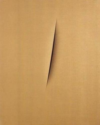
Lucio Fontana, Concetto Spaziale, Attesa, 1960
I had heard not very good things about the Lucio Fontana exhibition at the Musée d’Art Moderne de la Ville de Paris. At dinner last week, a friend looked appalled as she announced that over half the exhibition is taken up with ceramics and sculpture. It’s true: it took Fontana a long time to find his unique contribution to the history of art. In fact, it wasn’t until the 1950s, that is, halfway through the exhibition, that he starts putting holes in his canvases, and slicing them open. Up until this point his work is derivative and not very interesting. Even the early cut works are not so exciting, appearing as little more than thinly painted canvases with holes in them. It’s not until the 1960s, when he does nothing but cut and making holes in the canvas —  the final rooms of the exhibition — that the works come to be anything more than mediocre works with theoretical or historical rigour.
Lucio Fontana, Concetto Spaziale, Attese, 1966
One thing that surprised me (once I got to the final rooms of the exhibition) was that even though I always knew Fontana’s cuts are the ultimate iconoclastic gesture, I didn’t realize how little they have to do with painting. At times, the canvas is not even painted, but a piece of thin, almost transparent fabric covers the canvas and so the canvas is not even cut. The works are almost all entitled Concetto spaziale (Spatial Concept) thereby indicating the three-dimensional, articulation of an object in and as space, rather than as two dimensional images. And yet, while they are not about painting, the works are about the history of art. Fontana’s slicing open of the canvas speak a violence, disrespect, defacement, denigration of all that can be imagined by such a gesture. The act of cutting the face of the canvas, even when there is nothing on the canvas, is perhaps the most definitive act of iconoclasm.

Lucio Fontana, Concetto Spaziale, New York 10, 1962
Along with the displacement of the canvas as image, there is nothing to look at, even though the visual appearance of the canvas is always different from image to image. Visually, each spatial concept is like a repetition of those on either side of it. Whether there is one cut or a series of cuts, it doesn’t seem to make a difference, and we seem to be looking at a single concept being reiterated over and over again. And then, in the last few rooms — the 1960s — everything comes together a matter of years before Fontana dies. In the end, the works are about the sense of touch, they are erotic, they are gendered, imaginative, and somehow transport us to another level of experience. The cuts become a moment that we sense, an anterior moment, because it is as though we are looking at that moment of cutting itself. We get to feel the curve of the gesture of slitting – it’s incredibly sensuous. The cuts as the trace of the artist, are sensuous, physical, and they are no longer revealing violation, but some kind of spiritual belief, a calling. As Fontana approaches the end of his life, the cut is a creation, not a violation. But of course, it is still a violation because it slices the canvas open, however lovingly. And there is no mistaking that these are the gestures of a powerful male artist, making incisions that remind of female genitalia. Around the edges of the holes the paint is coagulated, where it has dried up, it is thick, we want to touch it, it is so tempting it arouses desire.
Lucio Fontana, Concetto Spaziale, 1962
In the final room of paintings, the holes on the canvas become bigger, they become gorgeous until there are more of the holes than the canvas. Finally, we realize, Fontana is an artist exploring the void. What in the early years was about making painting into sculptural, expressing the materiality of the canvas through its incision, by the late 1960s, Fontana is building sculptures that are constantly cutting away the material and all materiality, to find the nothingness. While the museum blurbs kept emphasizing Fontana’s interest in space and spatial organization, the works also strive towards its opposite, a non-space, absence.

Lucio Fontana, Concetto Spaziale. la Fine di Dio, 1966

It’s a spiritual practice – he’s actually a kind of romantic artist, not as modern as I have always assumed. At least, where the work might be modern in its material challenge to the identity and status of representation, especially painting, the most interesting dimension is the spiritual. Fontana strives for some kind of transcendence himself and we get to sense that journey. 


Images courtesy Musée d'Art Moderne de la Ville de Paris

Sunday, July 6, 2014

Christian Marclay, The Clock, 2010

Christian Marclay, The Clock, 2010

After all the excitement, the lines to get in, the prize at Venice in 2011, the world’s biggest art museums’ rush to buy a print, I was skeptical of Christian Marclay’s The Clock (2010). Can a collage film be that provocative? Even if it does last 24 hours? It was with some reluctance that I joined the line at midnight last Wednesday at the Pompidou Centre to see thousands of fragments of film, each of which features a clock, a watch, a precise indication of time, edited together to correspond to real time as it passes. It’s a novel idea, but would there be any depth to the Marclay’s installation? What was there beyond the technical wizardry demanded by the challenge of the editing? It’s true, that as an example of film editing, even though it is single channel video, Marclay’s The Clock is a masterpiece. And it’s a masterpiece because it is so much more than a collation of fragments.

All the publicity surrounding The Clock claims that the fragments are taken from the history of cinema. But that’s not entirely true. At least, in the three of the 24 hours I saw, the films were 80-90% American and of those, 90% were Hollywood and 100% were fiction. There were the odd clips from Italy, France, Britain, none from Latin America, none from Bollywood, and only two from Japan out of the whole of twentieth century Asian cinema. To be sure, the choice of clips reflects the video that Marclay makes: everything about the images’ editing is propelled by the logic of a Western narrative. This is not a criticism, it’s an observation, but an important one if we are to appreciate one of the most interesting things about the installation.

Marclay creates desire across the cut in a way that accentuates the very impetus of Hollywood narrative film. Narrative is designed to keep us watching, keep us mesmerized, keep us waiting to see what is going to happen next. It does this through suspense, through unfinished actions, partial stories, through manipulations in time and space that withhold and then reveal information. Classical film editing is designed to give us the illusion of knowledge, but really, it keeps us engaged by withholding, thus stirring the desire to know what happens next, or in the end. Marclay’s reiteration of this across 24 hours is perhaps the most remarkable thing about The Clock: the audience is kept in front of these fragments for hour upon hour. And yet, no story, scene, encounter, conversation, movement is ever finished. In fact, we don’t even see its beginning. We just see the presence of the clock. Often Marclay will tease the audience, further accentuating desire across the edit, by returning to a scene after an interlude of another scene from another film. This return adds to the desire across narrative that is already aroused by his use of the cut away from one scene to another. Thus Marclay never satisfies desire, but skillfully keeps it alive, perpetuating it from one fragment to the next, and ultimately, one 24 hours to the next.

Add caption
Another thing I found fascinating, was the cultural differences that were revealed in the three hours I watched. At 1am and 3am American teenagers are having sex, classical heroines are being woken in the middle of the night by absent husbands, or anonymous callers, Italian divas are just arriving home, even going out for the night, while the French are cooking late night dinner. Perhaps people in China sleep at this time which would account for the absence of films from that culture, an absence presumably motivated by the absence of clocks or watches in the films themselves. Of course, Marclay has constructed these cultural differences through editing, nevertheless, they struck me as accurate visions of the different cultures represented. Time in film, so I discovered, is also determined by gender and sexuality: In the early hours, American women are typically at home, irrespective of their age, men are usually in public spaces, unless of course they are Woody Allen having a nervous breakdown or John Turturro trying to write in Barton Fink.


In Marclay’s film, the cinema becomes a clock, reduced to its most basic element of time passing. That said, and this is where Marclay is commanding, the cinema as clock is undone when we remember that the time depicted is real time, that it is the same as the world we are living in. As Marclay’s film does this, the precipice between illusion and reality is removed, thereby questioning the whole medium of film,  its precise status as representation. I am sure that if I were to return to The Clock — if I had time — I would find other elements to hook me, to keep me there, and to bring me back again and again.  

Thursday, July 3, 2014

polke/richter. richter/polke @ Christie's London

Sigmar Poke, Gerhard Richter 
What was most surprising about this exhibition was the proximity of the two artists’ work in the 1960s and 1970s. I think of the two as being concerned with very different questions – Polke in the world of fantasy and dream while Richter stays obsessed with the practicalities of painting. Paintings such as Polke’s Bavarian, 1965 or Don Quichotte, 1968 are engaged with the familiar Richter discourse on the press, its relationship with painting, its inability to represent reality, the unreliability of the media. Polke takes up these questions in very different ways, specifically through distentions of the press image, while Richter repaints, blurs and reframes photographic images.
image not avaialable
Gerhard Richter, Frau in einer Hollywoodschaukel, 1968
Richter’s Frau in einer Hollywoodschaukel, 1968 raises the thematic engagement with the woman as performer, the star, Woman descending the staircase, 1965 becoming so much more than a quotation of Duchamp when seen in the light of this work. The removal of all narrative context, the blur, the push towards abstraction, all these characteristics, pushing the woman out of the image, and replacing it with the confusion of movement, the surfeit of reality in which the performer moves.

Sigmar Polke, Bavarian, 1965
As we know already, grey is so prominent in Richter’s early work. The grey work is dense and sensuous, just like the bigger squeegee works made in more recent years. In a work such as Grau, 1970 on display here, the imperative of seeing his grey works face to face is evident. We don’t even need to stand up close to see the brushstroke going across the canvas. And viewers will remark that it is a very different grey from the mountains, or that in Wolke, 1969 with the Cy Twombly like pencil scrawls, as though the world underneath the clouds is just there, not so important, able to be captured in a sketch. It is, of course, the sea. Even in these early days, Richter is at his most sensitive with clouds, the sea, nature of all kinds.
Gerhard Richter, Abstraktes Bild, 1986, oil on canvas, 69.7 × 100.3cm. Christie's Images Ltd, 2014
Gerhard Richter, Abstraktes Bild, 1986
Around the same time, while Richter’s works become ever more sensuous, tactile, Polke begins his love affair with enamel, acrylics, spray paints. Polke overpaints and abstracts, but the commonalities are becoming fewer. Polke uses the overpainting to interfere with what’s underneath, as though is a competition between the different layers and surfaces. Richter, however, uses overpainting as if in a social experiment, to see how the colours behave when they interact with each other. The result is more aleatory, more unpredictable, but always controlled, as we have come to expect of Richter. And unlike Richter, Polke is not engaged in a process of erasure and palimpsestic destruction, correction after building up the expectation of finality. The layers, however fused, are still final in Polke’s paintings.
Sigmar Polke, Laterna Magica, 1988-96 
Similarly, as always, I was surprised and delighted to see that in the 1980s Richter was already painting versions of his abstrakte Bilder that became so well known twenty years later. My sense is that Richter is never done, he always goes back to the concerns that preoccupied him, while Polke is on a trajectory that moves forward.


Polke and RIchter at the 1966 exhibition
Maybe because of my love of Richter’s paintings, or perhaps because of the exhibition itself, it seemed as though the display was more focused on demonstrating the connection of Polke’s paintings to Richter’s, attempting to convince of the status of Polke’s works as of equal interest. Of course, the connection began in 1966 with the exhibition polke/richter in Hanover to mark the closeness of their relationship. This doesn’t preclude, however, the possibility that one painter became great and the other, not quite as important.